| C H A P T E R 2 |
|
Building the Widget Hierarchy |
The tutorial section of this document comprises the following chapters:
The tutorial is meant to be read at your workstation while you follow the step-by-step instructions to build a simple interface. In the process, you will be introduced to all of the major features of X-Designer.
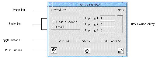
When completed, the tutorial interface looks like FIGURE 2-1:
 [ D ]
[ D ]
Most of this tutorial addresses the Motif-only style of development, except where reference to a more general technique makes the inclusion of cross platform information relevant. There are further specialized tutorials on structured code generation and cross platform development in Chapter 9, Chapter 10 and Chapter 12.
The first steps in building an interface are deciding which widgets should be used to build it and then developing an appropriate design hierarchy on the X-Designer screen. These steps are explained in this chapter. In the process, you will learn how to:
You should have X-Designer properly installed on your system before you begin the tutorial. Consult the installation instructions or your system administrator if X-Designer is not yet installed, or if the commands below do not bring up the main X-Designer screen.
Use one of the following commands to start X-Designer from within X. Either command brings up the main X-Designer screen.
or, for VGA or other small screen displays,
|
Note - If you invoke X-Designer with smallxd, the icons are smaller and slightly different from those shown in this document. |
X-Designer has numerous command-line options. These are documented in Chapter 24. You can also get a listing of them when you invoke X-Designer with the -x option. X-Designer also accepts all the standard X toolkit options.
To resume work on a previously saved design, you can specify the filename on the command line: xdesigner <filename>. The current filename is displayed in the window border. When there are unsaved changes the filename is followed by an asterisk (*).
To start X-Designer in Microsoft Windows mode, which enables the cross platform development capabilities, use the command line switch -windows.
The File Menu of X-Designer provides commands to let you save your work, exit the program and come back to your design later. We introduce these commands here so you can use them at any time during the tutorial.
You can save your design by selecting "Save as..." (<Ctrl+A>) from the File Menu. "Save as..." displays a file browser, described later in this chapter, which lets you specify a filename for your design.
If you have already specified a filename, you can simply select "Save" (<Ctrl+S>). This procedure is faster since you are not prompted for a filename. By convention, names for X-Designer design files have the suffix .xd.
X-Designer's window border contains the name of the current file. If there are any unsaved changes, the filename is followed by an asterisk (*).
In the Save As dialog you are given the option of saving a file suitable for importing into Visaj, the visual application builder for Java. This is described in detail in Moving X-Designer Designs to Visaj.
The Save Format option menu in the "Save As..." dialog gives you the option of saving your design as XML. This is a powerful and flexible markup language which, although similar in appearance to HTML, is a restricted form of SGML. It is widely used as the standard means of sharing data across applications, platforms and the Internet.
X-Designer can put the following aspects of your design into XML:
X-Designer uses an internal DTD (Document Type Definition) in order to describe your design. This feature is not intended to be a full description of Motif.
Appendix D explains how you can take the XML file and convert it for your own use. A working example is provided, showing how to convert the XML file to HTML and display it in a web browser.
To load a saved design file into X-Designer, use the "Open" command (<Ctrl+O>). "Open" displays a file browser, described later in this chapter, which lets you select an existing design file. "New" (<Ctrl+N>) clears the construction area and starts over with an empty design. "Exit" (<Ctrl+E>) terminates the program. All three of these commands discard any changes you have made to the design. If you have changes in your design that have not yet been saved, X-Designer asks if you want to save before it executes any of these commands.
You can select commands from the X-Designer menus in three ways:
A keyboard accelerator is a keystroke which is designated to execute a menu command. For example, you can press <Ctrl+S> to execute the "Save" command.
Accelerators work whenever the input focus is in any region of the X-Designer screen. Accelerators are printed in parentheses wherever this tutorial instructs you to execute a command. They also appear opposite the command name in the pulldown menu on the screen.
The underscored characters in menu names and options are mnemonics, a way of navigating in the menus without using the mouse. To pull down a menu by using its mnemonic character, press that character while holding down the <Meta> key. For example, you can pull down the File Menu by pressing <Meta-F>. After pulling down the menu, you can select any item by pressing its mnemonic character without <Meta>. The complete sequence for calling "Save" using mnemonics is: <Meta-F>, <s>.
In Chapter 3 you will learn how to set up accelerators and mnemonics on the menu bars you create in X-Designer.
The X-Designer interface includes a toolbar which can be configured by the user to contain buttons corresponding to menu items. The default toolbar layout is shown in FIGURE 2-2. See Toolbar for information on configuring the toolbar.

When you select a toolbar button, it does exactly the same as the corresponding menu button.
When X-Designer is in Microsoft Windows mode the default toolbar configuration contains two additional elements: the flavor option menu and the Microsoft Windows compliant toggle button. These are shown in FIGURE 2-3.
 [ D ]
[ D ]
The flavor option menu is used to indicate which target code will be generated, e.g. Motif, Motif XP. This is useful when using the toolbar code generation buttons. The Microsoft Windows compliant toggle indicates whether the current design is Microsoft Windows compliant. That is, whether X-Designer could generate valid Microsoft Windows code for it. The toggle button is also used to invoke the compliance checking process. These features are discussed more fully in Microsoft Windows Compliance.
When you pass the mouse pointer over items which are sensitive in the toolbar or the widget palette, information about that item appears below the pointer.
The status line appears at the bottom of the X-Designer window. Prompts are displayed here when the mouse button moves over a menu item, a button in a toolbar or a button in the Widget Palette. This relates to all toolbars, including those in the Pixmap Editor and the Layout Editor. The prompts tell you what each menu item or button does. Information can only be displayed for those buttons which are enabled (or sensitive).
All dialogs start with a Shell widget. The Shell icons, shown in FIGURE 2-4, are in the upper left corner of the widget palette. Although there is only one Shell widget, changing one of its resources makes four types of Shell widget. The four types of Shell are:
This is the main window of an application. It is the first one displayed when the application runs.
This also acts as the main window of an application and is provided for compatibility with earlier versions of Motif.
A window which remains visible when the main application shell is iconified and can be iconified independently.
A window which cannot be iconified independently of the main application shell. This is usually used for sub-dialogs in an application.
Far more detail concerning the Shell types is given in Shell Types.
Whenever you start a new design, all icons except the Shells are disabled.

 Click on the Session Shell icon.
A copy of the Shell icon appears in the construction area.
|
Note - Because the tutorial aims to teach you how to use X-Designer from scratch, you are asked to start in this way. You can, however, use the X-Designer utility AppGuru to start an application. See AppGuru for more details. |
When an instance of a widget is added to the hierarchy, it is assigned two names by X-Designer: a widget name and a variable name. The variable name is the name by which the widget is referenced in the code. The widget name is the name used by the toolkits to assign resources. By default these names are identical. X-Designer tries to assign sensible default names. These are of the form widget_nameN, where widget_name reflects the class of the widget (button, form, shell etc.) and N is an integer assigned by X-Designer and which increments within the widget class (button1, button2, form1, form2, etc.) However, because several features of X-Designer require explicit variable names, it is a good habit to assign explicit variable names to the most important widgets as you add them.
1. Double-click in the box opposite "Variable Name" at the top of the screen.
When you double-click in the box, all text in it is highlighted. Entering new text replaces the highlighted text.
The name is automatically assigned to the widget when you create and select another widget. You may also assign the name by pressing <Return> in the variable name box.
When you change the variable name, X-Designer automatically assigns the same name to the widget name unless you also explicitly specify a widget name in the "Widget Name" box.
The widget name does not have to be unique. Widgets with the same widget name can be configured to share resource settings. It is often convenient to group widgets by a common widget name so that end users can reset their resources with a single operation. You can do this by selecting all the widgets you wish to share a widget name and typing the name into the field labelled "Widget Name". Multiple Selection gives more information on selecting more than one widget. The subject of shared resources is discussed more extensively in Shared Resource Values.
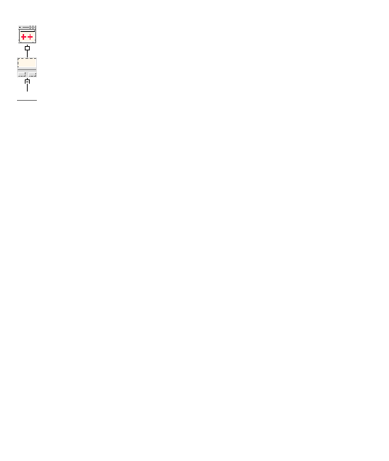
The Shell widget can have any kind of widget as its child; it can, however, only have one child. Therefore, you should choose a widget which can contain the rest of your layout. A MainWindow, BulletinBoard, Form, or DialogTemplate are commonly used. The DialogTemplate provides a convenient layout for the tutorial interface.
 Click on the DialogTemplate icon.

If you need help identifying the icons, turn on both names and icons from X-Designer's Palette menu or bring up the Palette Icons Dialog from the Help Menu (<Meta H> <p>). Also note that the status line at the bottom of the X-Designer screen will show the name of the widget when the cursor is positioned over an icon in the palette.
See The Palette Menu and Palette Icons....
The DialogTemplate is a container widget which can have three kinds of children: a MenuBar, any number of buttons and one additional child which is called the work area.
The DialogTemplate positions the MenuBar child at the top of the window and arranges all children which are buttons of any type in an evenly spaced row at the bottom of the window. This row of buttons is called the button box.
The DialogTemplate places the work area between the MenuBar and the button box, separated from the button box by a Separator (a horizontal line). The Separator is created as part of the DialogTemplate and will appear in your widget hierarchy automatically.
In the tutorial interface, FIGURE 2-1, the menu bar cascade buttons and the pushbuttons which make up the button box are labeled. The work area contains the radio box, row column array and toggle buttons.
 Assign the variable name: myDiag to the DialogTemplate.
As you add widgets to the design, we recommend that you continue to assign variable names to them. Explicit names make it easier to identify widgets and are required for certain operations. However, since X-Designer does not strictly require names unless you refer to the widget in some way, these instructions only include this step for names which the tutorial uses later.
When you added the DialogTemplate widget, you may have noticed that your layout became visible as a small rectangle over the construction area. This is the dynamic display window in which X-Designer builds a working example of your interface.
What you see in the dynamic display is a collection of widget instances. X-Designer does not draw pictures of widgets but actually creates them using the same Motif function calls that your interface will use when it is running. Right now the dynamic display window has few identifiable features because it contains only the Shell and DialogTemplate.
As you add widgets and move them around, they appear in this window as they will appear in your finished interface. You can use the normal window manager facilities to move the dynamic display window to a part of your screen where it does not obstruct your view of the hierarchy.
When you add widgets to your hierarchy, they may not appear in the dynamic display window where you want them. Later, you will use the Layout Editor to achieve the correct appearance.
The layout shown in a dynamic display is a fully active prototype of your interface; you can click on the buttons, pull down the menus, type text into text fields, and so on.
In X-Designer, it is possible to have one widget selected, many widgets selected or no widgets selected. If only one is selected, it is known as the currently selected widget. A widget must be selected before you can do anything to it, such as setting its resources, cutting and pasting, or giving it children. The selected widget is highlighted in the construction area and in the dynamic display.
Widgets that cannot legally be children of the selected widget are grayed out on the widget palette so you cannot select them.
As a rule, widgets are selected when you first add them to the hierarchy. Therefore, when you add the DialogTemplate, it is automatically selected and the next widget you add will be its child. However, widgets are not automatically selected if they cannot have children. To select a different widget, click on its icon in the construction area.
You can select more than one widget by:
In order to add widgets in another dialog to the selection, hold the Shift key down while selecting the Shell in the window holding area in order to retain the current selection.
When there is more than one widget selected, you can perform the following operations on them:
By clicking in a blank part of the construction area or by holding down the Shift key while clicking over each selected widget, it is possible to have no widgets selected. You will then only be able to perform those actions which affect the whole design.
The buttons at the bottom of the layout can be added directly as children of the DialogTemplate, as shown in FIGURE 2-7.
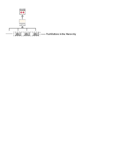
 With the DialogTemplate widget selected in the construction area, click three times on the PushButton icon.
Each time you click, a PushButton is added as a child of the DialogTemplate. The PushButtons also appear in your dynamic display with the default label button<n>. Later, in Chapter 3, you will assign proper text strings to these labels.
The dynamic display now looks like FIGURE 2-8.

The window title "Dialog" is the default used by X-Designer. Setting Resources for the Main Shell describes how to set your own title.
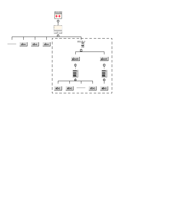
A menu bar at the top of the screen is a common feature of many computer interfaces. Motif provides a MenuBar widget, which is invisible until you add a series of other widgets to form pulldown menus. X-Designer guides you through the process of building a menu bar by graying out all widgets except the relevant ones. The hierarchy you need to add is shown in FIGURE 2-9.
 [ D ]
[ D ]
1. With the DialogTemplate widget selected, click on the MenuBar icon.
The DialogTemplate automatically places the menu bar above the work area in the dynamic display.
2. Assign the variable name: main_menu to the MenuBar.
3. Click on the CascadeButton icon twice.
When you add the CascadeButtons, they appear in your dynamic display with the default labels "cascade1" and "cascade2", as shown in FIGURE 2-10.

You can click on these buttons with the mouse and see that they are active but they don't do anything because they don't as yet contain any menus.
4. Select the first CascadeButton in the construction area and assign it the name: procedure_cascade
This long name means, on some displays, that the second CascadeButton cannot be seen on the menubar in the dynamic display. Later in this tutorial they will be assigned more sensible names. This will make them both appear as expected. Resize the dynamic display if you wish to see both CascadeButtons now.
1. Select the left CascadeButton in the hierarchy and click on the Menu icon.
2. Click on the PushButton icon twice.
3. Click on the Separator icon; then click on the PushButton icon again.
4. Click on the last PushButton and assign it the variable name: exit_button
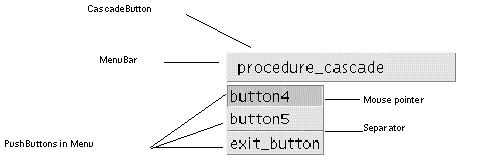
The left cascade button in your dynamic display now has a working pulldown menu, which you can see by placing your cursor on the cascade button and holding down mouse button 1, as shown in FIGURE 2-11.
 [ D ]
[ D ]
The PushButtons in this menu have default labels, which can be changed later. Menus can have three kinds of selectable children: PushButtons, ToggleButtons, or CascadeButtons (used to create submenus). They can also contain non-selectable Labels and Separators. This menu contains a Separator, which appears as a horizontal bar that separates the buttons into two regions.
To complete the MenuBar portion of the design hierarchy:
5. Select the second CascadeButton in the construction area and assign it the variable name: help_cascade
7. Click on the PushButton icon.
8. Click on the PushButton in the construction area and assign it the variable name: help_button
The second CascadeButton now also has an active menu with one option which you can pull down with the mouse in the dynamic display.
The interface now has a menu bar at the top and several buttons at the bottom. There is no work area until you add one. The DialogTemplate can have only one work area child. However, that child can be a container widget with multiple children. Since our work area will contain several widgets for choosing the ice cream flavors and toppings, we use a Form for the work area.
1. Select the DialogTemplate in the hierarchy.
The Form is invisible until you give it children. The options in our interface are arranged in three groupings:
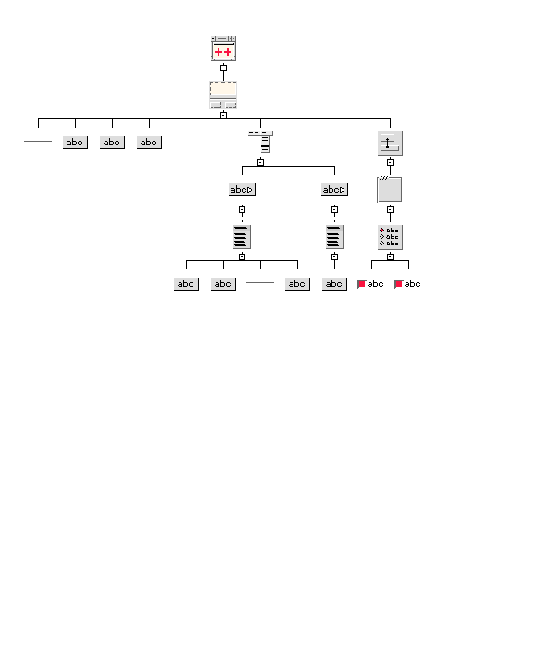
The RadioBox, like the Form, is an invisible widget which exists only to control the behavior of its children. It can contain a group of ToggleButtons which it configures as radio buttons. Only one radio button can be selected by the user at any one time. The hierarchy you need to add is shown in FIGURE 2-12.
1. Click on the Form in the hierarchy.
2. Click on the Frame widget icon.
The black line around the "Double Scooper" and "Small" radio buttons in FIGURE 2-1 is not the RadioBox itself but a Frame widget which contains the RadioBox. The Frame is used to display the logical grouping of the radio box components.
3. Click on the RadioBox icon.
4. Click on the ToggleButton icon twice.
The resulting hierarchy for the radio box is shown in FIGURE 2-12.
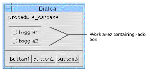
The dynamic display should now resemble FIGURE 2-13:
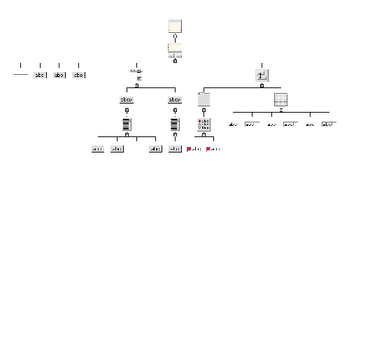
A RowColumn container widget will be used for the array of labels and text fields which specify the toppings in FIGURE 2-1.
1. Select the Form in the hierarchy.
2. Click on the RowColumn icon.
3. Click on icons in the following order: Label, TextField, Label, TextField, Label, TextField.
The Label and TextField widgets must be added in this order because the RowColumn always takes its children in order when constructing rows or columns. In this case, you are building rows and each row should have a label and a text field.
The RowColumn part of the hierarchy is shown in FIGURE 2-14.
This hierarchy results in the dynamic display shown in FIGURE 2-15.
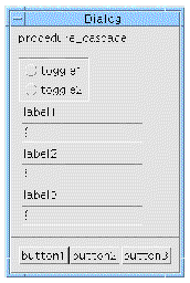
Because, by default, the RowColumn widget is laid out in a single vertical column, it doesn't look much like the finished layout in FIGURE 2-1. Later in the tutorial, you will change its resources to achieve the desired effect.
The last group of options required for the layout is the set of toggle buttons (representing ice cream flavors) at the bottom of the work area.
1. Select the Form in the hierarchy.
2. Click on the ToggleButton icon three times.
Your design hierarchy for the tutorial interface is now complete, as shown in FIGURE 2-16.
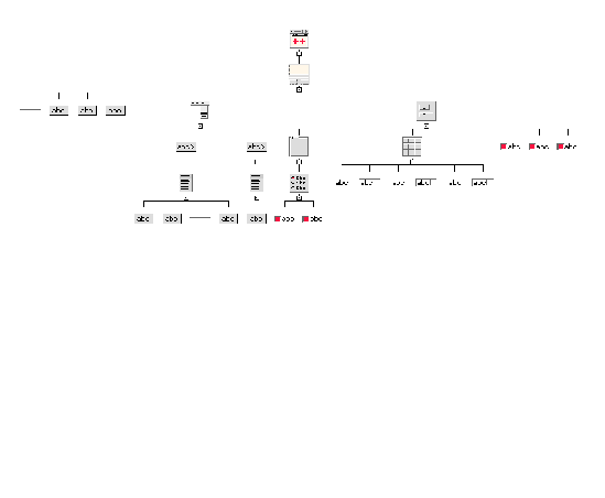
The interface, shown in FIGURE 2-17, is not yet finished but it contains all the necessary widgets in their proper parent-child relationships. In later chapters you will use resource panels and the Layout Editor to make it look more attractive.
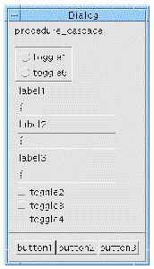
Notice the difference between the appearance of the toggle buttons you just added and the ones in the RadioBox. When ToggleButtons are inside a RadioBox, they become radio buttons. ToggleButtons that are not the children of a RadioBox can be switched on and off independently and have a square indicator.
Now that you have added the last widget to the design, save your work using the "Save as..." command.
3. Select "Save as..." from the File Menu.
4. Click to the right of the text in the "Selection" text field.
5. Enter a filename for your design.
By convention, X-Designer design files have the suffix .xd.
If you have already saved your design, you can use the "Save" command instead.
You have now finished setting up the main window of your interface. Most interfaces, however, have multiple windows. This chapter shows how to add a second window to your interface. The second window is a simple help screen, as shown in FIGURE 2-18:
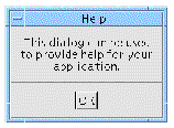
This help screen will appear when the user invokes the "About This Layout" command in your interface's Help Menu and will disappear when the user clicks on the "OK" button. This behavior is similar to that of X-Designer's copyright screen. Before you start, you may want to pull down X-Designer's Help Menu and select "About X-Designer". Note that the copyright screen appears when you click on "About X-Designer" and disappears when you click on its "OK" button.
To achieve these results, you will:
1. Create an additional window for your interface.
2. Design a simple help screen within the second window.
3. Create a "Show" link to display the help screen when the "Help" command is given from the Help Menu. This happens in Links.
4. Create a "Hide" link to remove the help screen when the user clicks on the "OK" button. This also happens in Links.
You can create a new window at any time, regardless of which widget is selected in the design hierarchy.
To add a dialog to your interface:
1. Click on the Dialog Shell icon in the widget palette.
See Shell Types for information on the different types of Shell.
X-Designer clears the construction area and displays the hierarchy for the new window. So far, this consists only of the Shell. Note that the dynamic display for the first window is still visible. As you build the secondary window, you can see both dynamic displays at the same time.
2. Click on the DialogTemplate icon.
4. Click on the PushButton icon.
The hierarchy for the subwindow and its default dynamic display are shown in FIGURE 2-19. Because this screen is so simple, you can use a Label instead of a container widget with children for the work area. The DialogTemplate centers the PushButton in the button box with the work area above it. There is no menu bar.
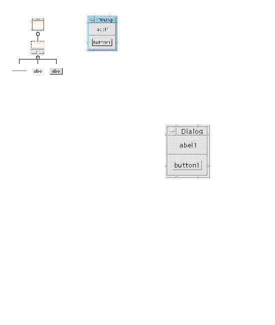
Set the text on the Label and PushButton:
5. Double click on the Label in the design hierarchy to bring up the Label resource panel.
6. On the "Display" page, double-click in the "Label" box and type:
Use <Return> to put newlines into a multi-line label. Do not put a newline at the end of the last line.
8. Click on the PushButton in the design hierarchy.
9. Double-click in the "Label" box and type: OK
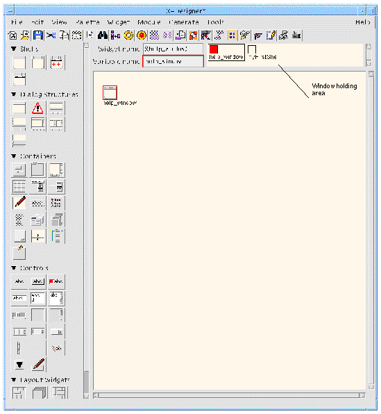
When you add a Shell to your design, regardless of which type of Shell it is, a corresponding icon appears in the window holding area at the top right of the main X-Designer window, as shown in FIGURE 2-20. To move from one window's hierarchy to another, click on the Shell icon associated with that window in the window holding area. Because most Shell icons look alike, and because icons are not necessarily shown in this area in the order in which you created them, it helps to assign explicit variable names to all Shell icons and turn on the "Show dialog names" option in the View Menu so that you can tell them apart.
The order of the Shells in the window holding area is significant. When a design is saved to a file, the Shells are saved in the order they appear in the window holding area - from left to right. When the file is loaded, X-Designer retains that order, displaying initially the hierarchy of the first (leftmost) Shell and its dynamic display. If this is not the one you wish to see first, you can change the order of the Shells in the window holding area by clicking over a Shell icon and dragging it to its new position while holding down mouse button 1.
 [ D ]
[ D ]
Assign a name to the second Shell in your design.
1. If the Dialog Shell is not already selected in the hierarchy, select it.
2. Double-click in the "Variable name" field.
4. Type <Return> or select any other widget in the hierarchy.
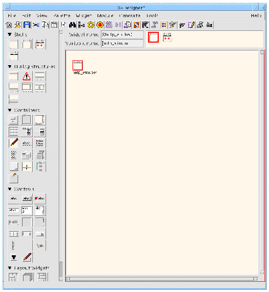
By default, the names of the Shells are shown in the window holding area. You can turn this off, if you wish to see what type of Shell they are, by doing the following:
5. Pull down the View Menu and select "Show dialog names" to turn the toggle off.
This concludes the step-by-step tutorial in this chapter.
At this point, you can proceed directly to the next chapter to continue the tutorial or you can continue reading and experiment with the various editing features discussed in the following pages.
X-Designer provides dragging, cutting and pasting facilities to let you edit the hierarchy. By using these facilities, you can alter your design dramatically without losing any of the resource values you have specified.
All editing functions act equally on the children of the selected widget. This lets you retain the relative positions of widgets inside a container widget such as a Form or RowColumn by moving the container widget and everything beneath it as a unit.
To drag a widget and its children to a new location, hold down mouse button 1 over the widget and drag it to its new location. When the widget is correctly positioned beneath a potential parent, a vertical line appears connecting it to the new parent. When you see the line, release the mouse button. If there is no line when you release the mouse button, the widget being dragged reverts to its former position.
You can drag widgets to a different position beneath the same parent, or to a new parent. However, X-Designer does not let you drag a widget to a position which is not valid in Motif.
Widgets that are part of a composite widget, such as the ScrollBars which form part of the MainWindow, can only be dragged by dragging their parent.
Because a widget's children are dragged with it, you cannot drag a widget to a position beneath its own child. To get this effect, use the copying facility described below.
If you change your mind after starting to drag a widget, you can cancel by dragging to an empty spot in the construction area.
The Shell widget cannot be dragged because it is not a valid child of any class of widget.
To copy a widget and its children to a new location while leaving the original widget in place, drag the widget using mouse button 2. A default variable name is assigned to the copied widget.
The Edit Menu has "Cut", "Paste", "Copy", and "Clear" commands which can also be used to alter the hierarchy. To copy a widget and its children onto the X-Designer clipboard, select the widget and use the "Copy" command (<keypad>Copy).
"Cut" (<keypad>Cut)) deletes the selected widget and its children and copies them onto the clipboard. "Clear" also deletes the selected widget and children but does not affect the clipboard. Cleared items cannot be pasted back into the hierarchy.
"Paste" (<keypad>Paste) inserts the contents of the clipboard directly beneath the currently selected widget. "Paste" is disabled if the clipboard is empty, or if the widget in the clipboard is not a valid child of the currently selected widget. The pasted widget is always made the last child of the selected widget. To place it in a different position, drag the selected widget with the mouse.
As well as copying to the X-Designer clipboard, you can copy a widget and its children to a clipboard file and paste in a widget from an existing clipboard file. This feature lets you build a library of design fragments, such as a standard menu bar. By convention, X-Designer clipboard filenames have the suffix .cxd.
To select any widget that is not highlighted, you can use the mouse or you can step up, down, left, or right in the hierarchy by using the arrow keys. The arrow keys only work this way when the construction area has the input focus. If the arrow keys seem to be disabled, use the <Tab> key to cycle the focus around the various areas of the X-Designer screen until they become active.
The search facility, available from the Edit menu, allows you to search for strings in preludes, callbacks, methods, translations, widget and/or variable names and string resources. The Search dialog is shown in FIGURE 2-22.
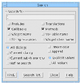
There are four main areas in the Search dialog - the text box containing the string to be found, a set of toggles to specify where to look for the string, a set of toggles to define which widgets to search and some options affecting the search.
You may type any string or part of a string in this text box. If you leave the text box blank, every string is matched. The search mechanism will look for strings according to which options have been selected from the String Type Panel.
This area consists of a series of toggles relating to the types of string which can be set for a widget. These are preludes, callbacks, methods, translations, widget names, variable names and string resources. You may select any number of these at once. Selecting none results in no matches.
You can specify one of the following:
You can choose whether you wish X-Designer to ignore the case of letters in the string when looking for a match. You can also select whether you wish to "Append" to an existing list of widgets which were found as the result of a previous search. If you are searching string resources or widget or variable names, you may select whether you want to search only those values which you have explicitly set or all values including defaults.
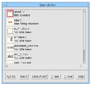
Pressing Find displays a list of widgets which match the search criteria in a separate dialog, the Search list dialog. Pressing "Search list" displays the list of widgets which have already been found - it does not repeat the search. This is useful if you have closed the Search list dialog and wish to view the same list again.
The Search list dialog shows a list of widgets which match one or more of the search criteria. After selecting a widget from this list, the following options are available:
Deleting a widget will remove it from the list, as will temporary deletions such as reset or cut and paste.
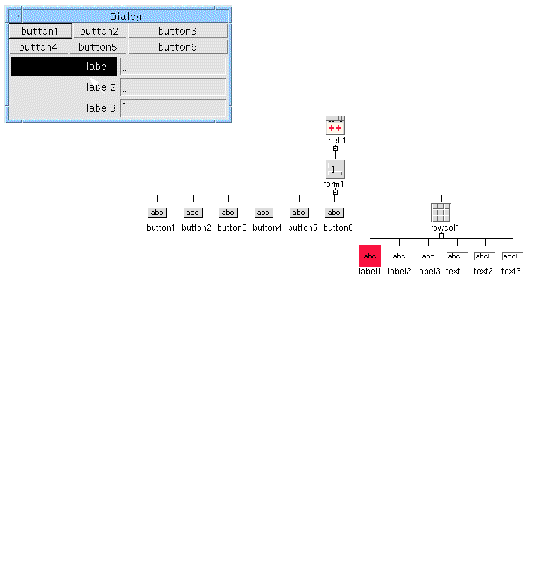
If you have a complex design, finding a particular widget in the design area can be difficult. X-Designer allows you to go straight to a widget via the dynamic display. With the pointer over the required widget in the dynamic display, simply press <Ctrl-G>. X-Designer immediately displays the widget, unfolding the hierarchy if necessary.
FIGURE 2-24 shows a simple example. With the Shell keyboard focus set to "Pointer" (as explained in Focus Policy and Fast Find), pressing <Ctrl-G> over the label in the dynamic display highlights the corresponding label in the hierarchy.
The key sequence <Ctrl-G> is a translation and can be altered using the following resource:
XDesigner.fastFindTranslation: Ctrl<Key>G
Fast find does not have any effect on translations in the generated code.
The fast find feature finds the widget which has the focus in the dynamic display. In order for this to work on widgets such as Labels, which do not usually receive the focus, you may need to set the keyboard focus of your Shell to "Pointer". Do this by going to the Settings page of the Shell widget's resource panel.
|
Note - Remember to set the shell's keyboard focus back again before generating code, otherwise the final application may be confusing if there are different focus policies for different shells. |
Ctrl-G is the translation provided by default. This is known not to conflict with any translation in the Motif widget set. Fast find works with third party widgets which support translations. For some widgets, however, this default translation may not be suitable. You may change the translation for:
XDesigner.fastFindTranslation: Ctrl<Key>G
XDesigner.XmText.fastFindTranslation: Ctrl<Key>F
XDesigner.xrtTable.fastFindTranslation: Meta<Key>M
XDesigner.my_text_widget.fastFindTranslation: Ctrl<Key>K
However, you may need or want to change the translation sequence for a particular widget type if the suggested default conflicts with the behaviour of the given widget.
Fast find translations can be configured for a widget class by specifying the input sequence required for the class. For example:
XDesigner.XmText.fastFindTranslation: Ctrl<Key>F
XDesigner.xrtTable.fastFindTranslation: Meta<Key>M
Fast find can also be configured for a widget instance:
XDesigner.my_text_widget.fastFindTranslation: Ctrl<Key>K
|
Note - It is possible to accidentally disable the fast find facility by providing translations of your own for a widget which override or replace the X-Designer fast find translation. |
The reserved value of <None> disables the application of the fast find translation for widgets of a specified class or instance. You may wish to use this instead of altering the values of the widget in xdconfig if you find that X-Designer's fast find mechanisms do not interact well with a given widget or widget class. Here are two examples. The first refers to a class of widgets and the second refers to a particular widget instance:
XDesigner.xintGraphObject.fastFindTranslation: <None>
XDesigner.my_text_widget.fastFindTranslation: <None>
The following simple entry will disable fast find for all widgets in X-Designer:
XDesigner.fastFindTranslation: <None>
Third party widgets can have the fast find feature disabled by using xdconfig; simply set the "Disable Find Widget" toggle on the widget page.
There are a number of ways in which you can affect the display of the X-Designer hierarchy. Most of these are available from the View Menu. These options only change the appearance of the X-Designer display and do not affect your design.
This View menu option (<Ctrl-W>) displays the variable name of each widget beneath its icon in the construction area as shown in FIGURE 2-25. The name shown is the unique variable name assigned to the widget, not the widget name.
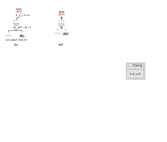
Each Shell widget in the design is represented by an icon in the rectangular area at the top right corner of the X-Designer screen. This rectangular area is called the window holding area. "Show Dialog Names" (<Ctrl-D>), available from the View menu, displays the variable name of each Shell widget beneath its icon in the window holding area, as shown in FIGURE 2-26. The icon shrinks to accommodate the name. This feature is useful in layouts with multiple windows.
 [ D ]
[ D ]
This View menu option (<Ctrl-L>) changes the appearance of the hierarchy in the construction area from a centered tree with branches spreading in both directions to a left-justified tree with branches spreading to the right, as shown in FIGURE 2-27. This feature can be useful for the rapid location of parent widgets in large designs
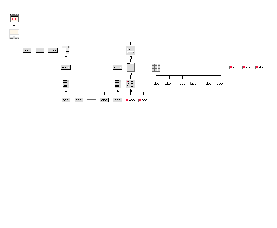
This View menu option is useful when the hierarchy is large and you want to see more of the structure in the same size window. The widgets shrink to a uniform small square so that more fit in the construction area, as shown in FIGURE 2-28. However, the distinction between widget classes and between folded and unfolded widgets, is lost. As with the other View options, your actual design is not affected.
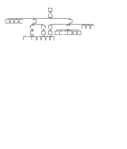
X-Designer provides a method of annotating the design hierarchy to indicate which widgets have been given a specified attribute. The View menu contains a pullright tear-off menu labelled Annotations, as shown in FIGURE 2-29.
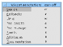
There are seven categories in this menu, each of which is a toggle button. To see which widgets in the design hierarchy have been given one of these attributes, set the toggle. The corresponding symbol is instantly placed next to each widget in the design hierarchy which matches the criteria of the associated symbol:
FIGURE 2-30 shows an annotated hierarchy.
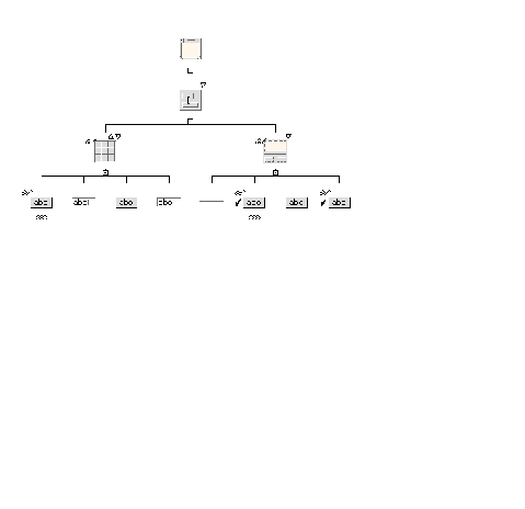
The annotation symbols are arranged around the widget icon in the hierarchy in such a way that all six symbols can be seen clearly. Where they appear in relation to the icon, how much space they use and the name of the pixmap are all specified in the X-Designer resource file. You can change these. See Appendix E for more details on X-Designer's application resources. The relevant lines are as follows--the example here is the search symbol:
XDesigner*annotate_search.annotatePosition:NorthWest
XDesigner*annotate_search.annotateWidth:10
XDesigner*annotate_search.annotateHeight:3
XDesigner*annotateSearchPixmap:an_search.xpm
The first line above specifies the geographical location NorthWest. This is in relation to the widget icon and can be any of the eight primary or secondary compass points.
The "Structure colors" option in the View Menu is useful when you are building a design that uses the structured code generation features. This option color-codes widgets that are designated as function or data structures, C++ classes, or Children Only place holders.
"Structure colors" has a pullright submenu. Select "Show colors" on the submenu to display your structures in the appropriate colors. Click on the dashed line at the top of the submenu to tear it off as a reference to the color code.
Widgets that are not designated as any kind of structure are displayed against the usual background color.
"Fold/unfold" is available from the Widget menu but it affects the appearance of the widgets in the construction area. As your hierarchy becomes larger, you may want to fold a widget which has a number of children so that its children do not take up so much space in the construction area. For example, in the tutorial layout, you may want to fold the MenuBar widget because its children fill so much display space. When a widget is folded, its children are not shown in the hierarchy. Folding widgets is only a display convenience and does not remove widgets from your design.
There are two ways of folding a widget. One involves using the Widget menu, the other involves selecting a special icon in the hierarchy.
Select the widget to be folded. Pull down the Widget Menu and select "Fold/unfold" (<Ctrl-F>). The same command unfolds the selected widget if it is already folded.
Select the fold icon in the hierarchy. This icon appears below each widget which may have children and looks like a small box containing a minus sign (-). Clicking on this icon folds the hierarchy below it.
When the hierarchy is folded, whether by this method or by using the Widget menu, the fold icon changes to display a plus sign (+). Selecting this icon will unfold the hierarchy below it.
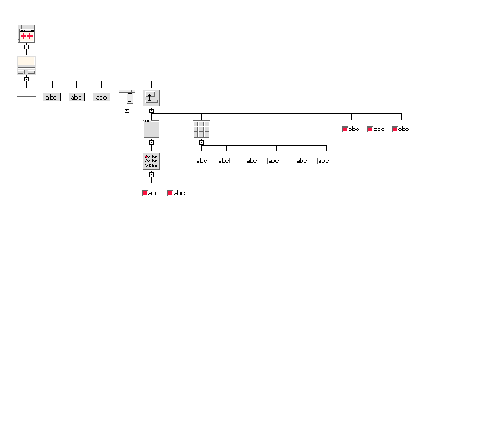
FIGURE 2-31 shows a folded widget.
The Transform (<Ctrl-Shift-R>) option in the Widget menu allows you to change specific controls into another, keeping any resources, constraints or callbacks that have been set.
The following widgets may be transformed into any of the others in the list:
The following widgets may be transformed into any of the others in the list:
In addition the following widget transformations can be performed:
Widget tranformations are particularly useful when you need to fix compliance failures. See the Microsoft Windows Compliance.
You can also apply the resource file masking toggles to multiply selected widgets. This toggle can be in one of three states: on, off and mixed. If all of the selected widgets have the same setting for this toggle, it shows on or off, as appropriate. If they have different settings, however, it shows the mixed state. More information on the function and purpose of these toggles is given in Masking Resources.
The Print Dialog lets you print out a hard copy of your hierarchy at any time while you are developing it. The Print Dialog is shown in FIGURE 2-32.
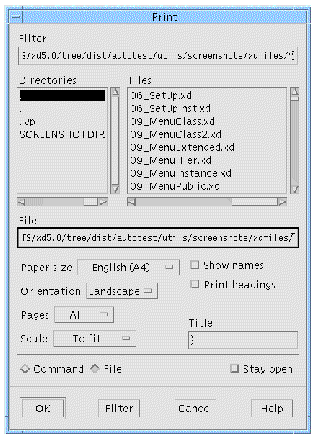
To print to a file, click on the "File" toggle and enter the filename in the text box under "File". To send to a printer, click on the "Command" toggle and enter the command, such as lpr, in the same text box, which is now labelled "Command". The output is Postscript, so a Postscript printer or viewer is required.
The option menus in the Print Dialog let you specify the page size, orientation, pages and scale. In the "Scale" option menu, the reduced scale option prints the diagram two-thirds of its actual size. Note that if the "Scale to fit" option is not selected, the diagram prints on as many pages as required. The "Pages" option menu lets you print either all the hierarchies in your design if your design contains more than one window or just the hierarchy currently displayed in the construction area.
Selecting the "Show names" toggle lets you print the variable names of the widgets. Selecting the "Print headings" toggle puts a border around the hierarchy and prints a title, which you can specify in the "Title" text field. The title is restricted to one line of text.
The file browser, shown in FIGURE 2-33, lets you specify the name of a X-Designer file to open or save. The file browser is displayed when you select any command that requires you to specify a filename, such as the "Open" and "Save as..." commands from the File Menu. You can either enter a pathname in the "Selection" field or use the mouse to select an existing filename from the "Files" list.
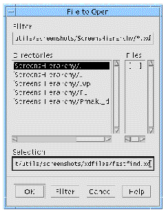
The "Filter" text field displays the current directory and a filename pattern to be matched in the "Files" list. You can change the current directory and filename pattern by editing the text in the "Filter" text field and clicking on the "Filter" button at the bottom of the screen.
The subdirectories of the current directory appear in the "Directories" box. To navigate through the directory structure, either click on a selection in this list and then click on "Filter", or double-click on the selection.
The filename pattern controls the "Files" listing. Any filenames in the current directory that match the pattern appear in the "Files" box. You can change the pattern by editing the text and clicking on the "Filter" button at the bottom of the screen. If the pattern is an asterisk (*), all files in the current directory are listed. If the pattern is *.xd, only files that have the .xd suffix are listed. To select a file, either click on the filename then click on the "OK" button at the bottom of the screen, or double-click on the filename. When you select a file, X-Designer proceeds with the operation you requested, such as "Open", "Read", or "Save as...".
When you save a file or generate code, you can either select an existing filename or specify a new filename in the "Selection" field and click on "OK".
Copyright © 2003, Sun Microsystems, Inc. All rights reserved.