| C H A P T E R 4 |
|
The Layout Editor |
The next step in designing your interface is to rearrange the widgets geometrically. The DialogTemplate automatically places the menu bar at the top of the window and arranges the buttons at the bottom. However, the arrangement of widgets inside the Form is up to you.
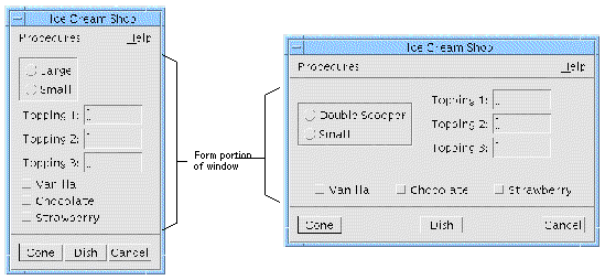
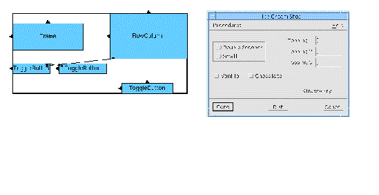
FIGURE 4-1 shows the present appearance of the tutorial interface and how it will appear when you finish making the modifications in this chapter.
 [ D ]
[ D ]
The arrangement of widgets inside the Form is called the layout. To make these changes in the layout, you will perform the following steps with X-Designer's interactive Layout Editor:
1. Move widgets around to the approximate layout you want.
2. Attach the top and left side of the Frame to the sides of the Form at a fixed offset.
3. Attach the RowColumn to the Frame at a fixed offset.
4. Align the tops of the three ToggleButtons located at the bottom of the layout.
5. Set position attachments for proportional spacing of the three ToggleButtons.
Several classes of Motif widgets can impose geometric rules on their children. You have already seen that the children of a RadioBox, RowColumn and MenuBar are laid out in specific ways. In a MenuBar, the CascadeButtons are laid out in a single row. In a RowColumn, all children are laid out in a grid.
Three types of widget, Form, BulletinBoard and DrawingArea, allow more flexible layout of their children. These three widget classes are called layout widgets. X-Designer provides an interactive Layout Editor for laying out the children of these widgets.
Attachments are constraints that force a widget to be in a certain location relative to the layout widget or to another child of the layout widget. All three types of layout widget let you attach their children's upper left and lower right corners at any x,y location relative to the layout widget. If you constrain the upper left corner of a widget, you fix its location. If you also constrain its lower right corner, you also fix its size. These are the only attachments offered by the BulletinBoard and DrawingArea widgets.
The Form widget lets you attach a side of a child widget to a side of the Form at a specified distance (measured in pixels). This has the effect of positioning the widget at a specific x,y location, like the attachments provided by the BulletinBoard and DrawingArea. In the case of the Form, this type of attachment is called a Form attachment to distinguish it from other types of attachments available for the Form.
The Form also has position attachments, which are specified as a percentage of the total width or height of the Form. When you use position attachments, widgets get farther apart when the window gets larger so that the interface can take advantage of extra space when it is available.
Widget attachments let you attach two of the Form's children to each other at a specified absolute distance (measured in pixels). Attachments can be made edge to edge or top to bottom. Facilities are also provided for you to align and distribute a group of widgets.
These additional features of the Form allow you to design a layout which retains its appearance when the main window or an individual widget is resized. For example, by attaching a widget to both sides of the Form, you can make it stretch when the main window becomes larger. By attaching two widgets edge-to-edge, you can ensure that the spacing between them will be preserved even if one of them moves or changes size.
You can display the Layout Editor for any layout widget in your hierarchy by selecting it and either selecting "Layout" from the Widget menu or clicking on the Layout button on the toolbar, as shown in FIGURE 4-2.

To edit the layout in your Form:
2. Click on the Layout button on the toolbar.
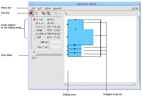
This displays the dialog shown in FIGURE 4-3.
 [ D ]
[ D ]
The editing area displays a sketch of the layout. Widgets in the editing area are displayed schematically as boxes within a larger box which represents the Form. In FIGURE 4-3, the boxes represent, from top to bottom, the Frame, the RowColumn and the three ToggleButtons.
If widgets overlap, the outlines are still visible so that you can see where they are. When you select a widget, the smallest enclosing widget is selected enabling you to select a widget which may be obscured by a larger one.
The Layout Editor shows the Form's children but nothing lower on the hierarchy. For example, you cannot see the RadioBox and its ToggleButtons inside the Frame nor the Labels and TextFields inside the RowColumn. You also cannot see the MenuBar or the PushButtons, which are outside the Form.
A set of radio buttons on the left side of the editor screen lets you select one of several editing modes. Selecting an editing mode assigns that function to mouse button 1.
You can also use any mode, regardless of which is currently selected, by using the mouse button sequence indicated next to that radio button. For example, you can always use mouse button 2 to move a widget, or <Shift-button 2> to set an attachment.
To select a widget, click over it in the editing area. To select additional widgets, hold down the Shift key while selecting them. The primary selection is always displayed with a thick border, secondary selections are displayed with a dotted border. The last widget to be added to the selection is always the primary selection. You need to know which is the primary selection because alignments are performed by aligning to the primary selection.
Below the menu bar is a toolbar containing the following buttons which are also available from the menus:
The Smart Panel Layout is a shortcut means of laying out a simple panel. This is a very common layout and is usually made up of an equal number of labels and textfields, such as you might find in a form. After adding your widgets, display the Form Editor and click on the Smart Panel Layout button. The widgets are arranged in two columns with all the appropriate attachments. If you specify an offset or position, these are taken into account when the layout and attachments are made. If some of the widgets are selected, only the selected widgets are laid out in this way, the other widgets are left as they are. Note that shift-click is used to select widgets in the layout editor. Pressing Undo restores the previous layout.
Like the Smart Panel Layout described above, this is a shortcut means of laying out widgets in a ButtonBox style. This is for laying out Buttons horizontally with regular spacing. If no objects are selected, all the children of the Form are laid out as a ButtonBox. Otherwise, only selected objects are affected.
Pressing the automatic attachments button converts a layout using absolute positioning to a more flexible layout using Form attachments. This is most useful in migrating a design which was created using a GUI builder which insisted on using absolute positioning. X-Designer is able to use the full power of the Form layout widget.
The File menu contains one item, "Close", which removes the Layout Editor window from the screen.
The Edit menu provides three functions.
"Undo" reverses the last operation done in the Layout Editor. Selecting "Undo" repeatedly lets you step back through multiple operations. As with other Layout Editor commands, you may need to "Reset" before you can see the effect of "Undo".
"Reset" (<Ctrl>-T) destroys the current instance of the layout widget, along with its children, and re-creates your dynamic display.
Sometimes new constraints are not reflected accurately in the dynamic display window until after you reset the layout widget. Therefore you should reset often when using the Layout Editor, especially if a change does not produce the result you expect.
If container widgets within a Form do not properly display after a reset, select a widget higher up the hierarchy and do another reset.
The View Menu of the Layout Editor provides four useful display commands.
This option highlights the widget edge closest to the pointer when the pointer is inside the widget. Any attachment you make is applied to the highlighted edge of the widget. "Edge Highlights" is on by default.
 Move the pointer around the sketch of the Form and note that, whenever the pointer is inside the box representing a widget, the edge nearest the pointer is highlighted.
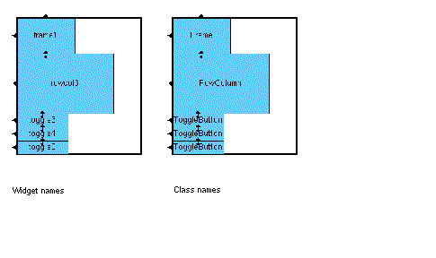
This option displays an identifying string inside each box in the editing area. When you pull down the View Menu and select "Annotation", a pullright menu appears with a choice of "Widget names" or "Class names". "Widget names" (<Ctrl-W>) displays the variable name of each widget. "Class names" (<Ctrl-N>) displays the class of each widget, such as "Frame" or "RowColumn". Selecting one option disables the other. Selecting the same option when it is set removes all annotation from the display.
The annotation options are illustrated in FIGURE 4-4.
 [ D ]
[ D ]
 Pull down the View Menu and select "Class names" from the "Annotation" submenu.
Use "Zoom In" to increase the display scale and "Zoom Out" to decrease the scale.
The Layout Menu provides some layout commands in addition to those available in the editing modes palette which is described in Editing Modes. There are two functions available from this menu--align and distribute.
Pressing "Align" displays a pull-right menu containing the various types of alignment available. These functions are only enabled if there is more than one widget selected. See Aligning Widgets: Group Alignment for a detailed description of the alignment functions available from this menu item.
Pressing "Distribute" displays a pull-right menu containing two further pull-right menus which lead to the distribution options available. These functions are only enabled if there are more than two widgets selected. See Distribute for a detailed description of the distribution functions available from this menu item.
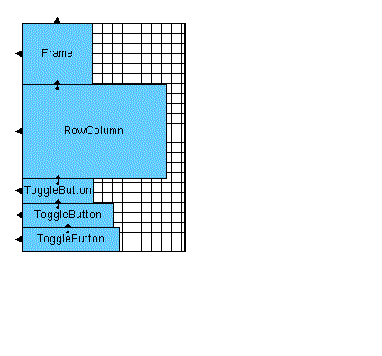
To display a grid on your layout, use the grid slider, situated in the bottom left corner of the dialog, to select a spacing from 2 to 50 pixels. The number of pixels is considered to be at 1:1 scale so that the grid will scale with the layout if you use the Zoom commands.
The "Move" and "Resize" modes snap to the grid if one is visible. When you move a widget, its top left corner snaps to the nearest grid intersection. Likewise, when you resize a widget, its lower right corner snaps to the grid.
You can disable the grid by setting the slider to zero.
 Set the grid slider to 10 pixels.
Most Form resources should be left at their default values. You could, however, consider resetting the "Resize Policy" resource to "Grow".
1. Double click on the Form widget or press the "Resources" button in the toolbar to display the Form's resource panel.
2. Select the "Settings" page of the resource panel.
3. Set "Resize policy" to "Grow".
4. Click on "Apply" and then "Close".
If you do not set this resource, the Form always shrinks immediately to the minimum size when you move widgets around, which can be annoying. With a policy of "Grow", although you may sometimes have extra blank space in the layout, it goes away when you reset the Form.
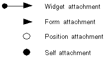
The attachments are displayed in the Layout Editor using symbols as shown in FIGURE 4-6.
 [ D ]
[ D ]
Your layout already has two kinds of attachments: Form attachments and widget attachments. Form attachments are shown as arrowheads on one edge of the widget. The Frame, which is the top widget in the default layout, has two such attachments--to the top and the left side of the Form. The other four widgets are each attached to the left side of the Form. All the widgets are stacked top to bottom in the order in which they were added to the hierarchy.
Each of the four lower widgets is attached to the widget above it. A widget attachment is shown as an arrow with an arrowhead at one end and a small filled circle at the other.
In addition to the above default attachments, a MenuBar is treated as special and given a default attachment from its right edge to the right side of the Form. This is to make a MenuBar fill the top of the window and resize appropriately.
The "Move" command lets you drag a widget to a new location. This sets two Form attachments which fix the widget's upper left corner at that point. The best way to start arranging any layout is to use this mode to place all the widgets approximately where you want them; you can then use the other modes to specify widget positioning and resize behavior more precisely.
When you move a widget, X-Designer removes all attachments from that widget. Attachments to the widget are preserved. You can prevent this from happening by pressing the Control key while moving a widget. X-Designer removes attachments by default because other functions such as align and distribute rely on making attachments. Often the new attachments conflict with the old and cause the Form to report errors. Once into this state it is often difficult (though not impossible) to recover--see Circular Attachments. You can avoid this situation by allowing X-Designer to remove all attachments before performing one of the layout functions.
1. Click on the "Move" toggle.
Once in "Move" mode, you can drag widgets around in the layout with mouse button 1. You can also move widgets using mouse button 2, regardless of the current mode.
2. Place the pointer inside the box corresponding to the RowColumn.
3. Hold mouse button 1 down and drag the RowColumn to the right until it overlaps the right edge of the Form.
To do this, you have to drag the RowColumn so that its right margin extends beyond the edge of the Form. This is acceptable. When you release the mouse button, the Form automatically resizes to allow room for all its children.
4. Drag the RowColumn up until its top is aligned with the top of the Frame.
If the display is not correct, reset the Shell, select the Form and then re-display the layout editor.
FIGURE 4-7 shows what your layout looks like now and the resulting dynamic display. The DialogTemplate automatically adjusts the size of the MenuBar and the spacing of the PushButtons to accommodate the new width of the Form.
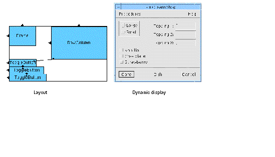
The tops and left edges of the RowColumn and Frame have arrowheads, indicating that they are attached to the top and left side of the Form. "Move" works by setting two attachments to the Form to fix the upper left corner of the widget at its new location. You can make these attachments either at a distance of zero (so that the widget touches the side of the Form) or at a non-zero distance to produce a space between the widget and the Form. This distance is called the offset. In this case, the left edge of the RowColumn is attached to the Form at a non-zero offset. Offsets are discussed in a later section of this chapter. In the "Move" mode, X-Designer calculates the offset based on the location of the pointer.
There can be only one attachment on each side of a widget. "Move" breaks any attachments that are already on those edges and then sets two new attachments on the top and left edges of the moved widget. In the default layout, the top of the RowColumn was attached to the bottom of the Frame. This attachment no longer exists because "Move" has set a new attachment on the top of the RowColumn. "Move" breaks the attachments made from a widget but preserves any attachments made to it from other widgets.
|
Note - You can retain attachments during a "Move" by holding down the Control key as you move the widget. |
Note that when you moved the RowColumn widget up, the three ToggleButtons moved with it. This happens because of the attachments between the widgets. Because the top of the first ToggleButton is attached to the bottom of the RowColumn, when you move the RowColumn up, the top ToggleButton also has to move. The other two ToggleButtons also move up in a chain reaction since the second is attached to the first and the third to the second.
The attachment from the ToggleButton to the RowColumn was not removed when you moved the RowColumn. This is because this attachment belongs to the ToggleButton and not to the RowColumn. This distinction is discussed later in this chapter.
The tops of the RowColumn and the Frame are now lined up. However, there is an important difference in the way they are attached to the Form. The top of the Frame has a default attachment which was left over from the default layout. The RowColumn has a zero attachment which was set when you used the "Move" mode.
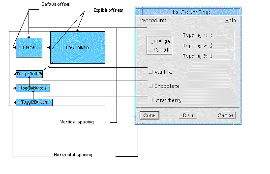
Default offsets are controlled by the "Horizontal spacing" and "Vertical spacing" resources of the Form. Explicit offsets override Default offsets through actions such as Move or Align in the Layout Editor. The Frame is 0 pixels from the top of the Form because the spacing resources are both 0 by default.
To see the effect of resetting the spacing:
1. Select the form and click on the "Resources" button on the toolbar.
3. Double-click in the "Horizontal spacing" box and type: 20
4. Double-click in the "Vertical spacing" box and type: 20
5. Click on "Apply" and then "Close".
FIGURE 4-8 shows the results. All attachments with default offsets, including those on the Frame and the three ToggleButtons, now use the 20 pixel spacing. The RowColumn doesn't move because its attachments were set with "Move" and have explicit offsets that do not refer to the spacing resources. The result is that the Frame and RowColumn are no longer aligned.
 [ D ]
[ D ]
The additional spacing between the ToggleButtons forces the entire Form to become larger. The DialogTemplate also resizes to accommodate the Form.
An advantage of default offsets is that they let the user control the amount of spread in the layout at run time. The main disadvantage of default offsets is that they require all spacings in your layout to be the same, which may not be what you want. Also, you should be careful not to confuse default and explicit offsets, since default offsets may change while explicit ones remain the same. For example, your Frame and RowColumn lost their alignment when you changed the spacing because one has an explicit offset and the other a default offset from the top of the Form. The Layout Editor screen does not distinguish between explicit and default offsets.
You can attach a widget to the Form by dragging from just inside the widget's edge to a point just outside the side of the Form. This can be done with button 1 in "Attach" mode or with <Shift-button 2> in any mode. Attachments are set using the offset value in the "Offset" field. If the "Offset" field is empty, a default offset is used.
1. Click on the "Attach" toggle.
Note that when you are in the "Attach" mode or have <Shift-button 2> down, the pointer becomes a set of crosshairs.
Now replace some of the default attachments with attachments that use explicit offsets of 0 pixels.
2. Click in the "Offset" box and type: 0
Attach the left edge of the Frame to the left side of the Form:
3. Place the crosshairs just inside the left edge of the Frame so that the left edge highlights.
4. Hold down mouse button 1 and drag to a position just outside the left side of the Form so that the left hand Form edge highlights.
The new attachment, like the old one, appears as a filled triangle on the side of the Frame. You can see its effect because the explicit 0 offset moves the Frame over to the side of the Form. If this does not happen, try setting the attachment again.
Do the same thing for the "Vanilla" ToggleButton:
6. Place the crosshairs just inside the left edge of the top ToggleButton so that the edge highlights.
7. Drag with mouse button 1 to a position just outside the left side of the Form so that the left hand Form edge highlights.
The ToggleButton moves over to the side of the Form.
The top of the Frame looks good at its present location. The 20 pixel offset from the top of the Form centers the Frame with respect to the RowColumn. However, this should be an explicit offset, not a default, so that it will remain constant if the Form spacing resources change. To change to an explicit offset, you must replace the attachment.
9. Double-click in the "Offset" field and type: 20
10. Place the crosshairs just inside the top of the Frame so that the edge highlights.
11. Drag with mouse button 1 to a position just outside the top of the Form so that the top Form edge highlights.
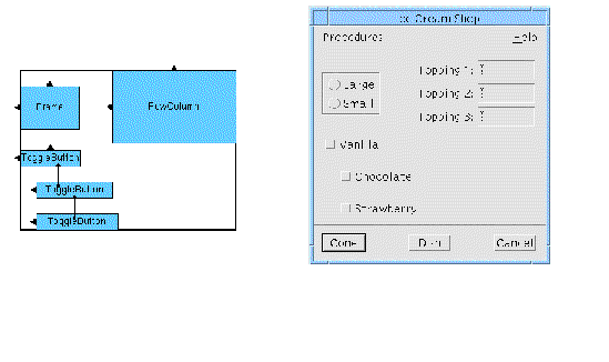
FIGURE 4-9 shows the result. If your dynamic display does not look the same
Setting a widget attachment between two widgets in the Form is similar to attaching a widget to one side of the Form. To attach a pair of widgets, you simply drag the crosshairs from just inside one of the widgets to just inside the other.
To attach two widgets edge to edge, either touching or with an offset, you either attach the right edge of one to the left edge of the other, or the top of one to the bottom of the other.
You should still be in "Attach" mode from the last section. Attach the left side of the RowColumn to the right side of the Frame:
1. Double-click in the "Offset" box and type: 50
2. Position the pointer just inside the RowColumn's left edge so that the left edge highlights.
3. Hold down mouse button 1 and drag to a point just inside the Frame, until the right edge of the Frame highlights.
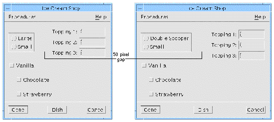
The new attachment appears as an arrow with an arrowhead pointing at the right edge of the of the Frame and a filled circle on the center of the left edge of the RowColumn. The RowColumn repositions itself with a gap of 50 pixels from the right edge of the Frame.
Although this does not change your layout much now, there is a significant advantage to this kind of attachment if the strings inside the Frame are likely to change. The RowColumn is now positioned relative to the right side of the Frame and not relative to the side of the Form. Even if the Frame grows, the RowColumn preserves the 50 pixel distance.
5. Double-click on the first radio button in the radio box in the construction area.
6. Go to the "Display" page of the resource panel and change the button's label to: Double Scooper.
The results are shown in FIGURE 4-10.
 [ D ]
[ D ]
Attachments are not symmetrical. When you create an attachment by dragging the pointer from Widget A to Widget B, the attachment is said to originate from Widget A. To indicate this, X-Designer draws an arrow from inside Widget A to Widget B. The attachment you have just made originates from the RowColumn.
Attachments apply only to the widget from which they originated. For example, the attachment you have just made constrains the RowColumn to a certain position relative to the Frame. If the Frame is moved or resized, the RowColumn moves in turn. If the RowColumn is moved or resized, the Frame is unaffected.
Note that the top ToggleButton has an attachment to the bottom of the RowColumn. This attachment is left over from the default layout and has the default offset. It is therefore controlled by the Form's spacing resources, which are still set at 20 pixels.
You were able to move the RowColumn away from the first ToggleButton because of the following rules:
1. Attachments on the top or bottom of a widget only affect its y coordinate.
2. Attachments on the left or right edge of a widget only affect its x coordinate.
The top of the first ToggleButton is still 20 pixels (the current vertical spacing) from the bottom of the RowColumn. Because there is no attachment between the ToggleButton's left or right side and the RowColumn, the RowColumn's position in the horizontal dimension has no effect on the ToggleButton.
Change the spacing of this attachment to 10 pixels:
1. If it is not already selected, click on the Form in the construction area.
2. Double-click in the "Offset" field and type: 10
3. Position the crosshairs just inside the top edge of the top ToggleButton so that the edge highlights.
4. Hold mouse button 1 down and drag to a position just inside the bottom edge of the RowColumn so that the edge highlights.
The new attachment replaces the old one and the top ToggleButton adjusts its position.
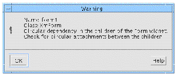
The Motif rules for the Form widget prohibit you from attaching Widget A to Widget B and then also attaching Widget B to Widget A. This is called a circular attachment. Any larger attachment loop, such as attaching Widget A to B, B to C and C to A, is also considered circular and results in an error. If your layout contains such a loop, X-Designer displays the warning message shown in FIGURE 4-11 and you must break one or more attachments to eliminate the loop.
 [ D ]
[ D ]
Circularity is only a problem with widget attachments. Attachments to the Form and position attachments (see Proportional Spacing: the Position Mode) cannot produce a circular attachment because these attachments can only originate from the child widget and not from the parent Form.
A good method for avoiding circularity is to make all attachments between widgets point in only two directions, usually up and left. When you lay out your interface, start at the upper left corner and work down and to the right. Whenever you attach two widgets, make the attachment originate from the widget that is below or to the right. In this way, all the attachment arrows point the same way and you avoid accidental circular attachments.
Use any of the following methods to remove attachments in the Layout Editor:
Motif requires that each widget have at least two edges attached. If you remove all attachments, the Form supplies simple Move-type attachments, based on the widget's last location, when you reset.
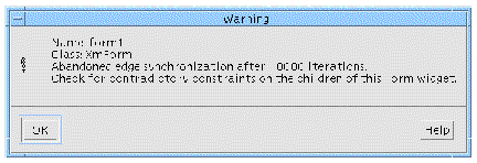
You can specify attachments that contradict one another without being circular. For example, you might attach the left edge of a widget to the right side of the form using a positive offset. When you reset a Form that has contradictory attachments, Motif tries to calculate a layout that will satisfy all of them. If a satisfactory layout has not been found after a large number of iterations of a loop, the loop is broken and X-Designer displays the warning message shown in FIGURE 4-12. In these circumstances, some widgets may appear very small, or the Form itself may be resized very wide or long, until you remove the attachment that is causing the problem.
 [ D ]
[ D ]
As with circular attachments, contradictory attachments must be removed before you can proceed.
A widget can have only one attachment originating from each of its four edges. That attachment can be of any type: a Form attachment, a widget attachment or a position attachment (see Proportional Spacing: the Position Mode). Whenever you specify a new attachment originating from one edge of a widget, it replaces any attachment that was already there.
There is no limit to the number of attachments to a widget, provided they all originate from other widgets.
You can align the tops of two widgets by attaching them top to top with an offset of zero. An easy way to do this is to select the "Align" mode of the Layout Editor. The "Align" mode is simply an attachment with an explicit zero offset. You can also align a pair of widgets on any other edge: bottom to bottom, left to left or right to right. Be careful to avoid circularity when you use this feature.
To align the tops of the first two ToggleButtons:
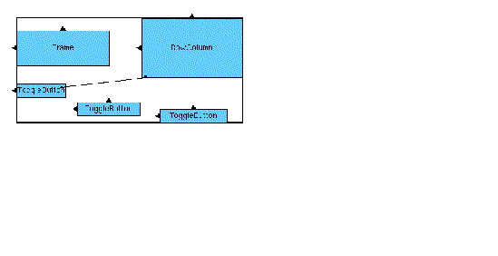
1. Use "Move" (button 2) to move the bottom two ToggleButtons into a rough horizontal row.
Do not move the top ToggleButton.
So that you can see the effects of "Align" and, later, "Distribute", deliberately leave the tops of the widgets and the spacing of their edges, slightly uneven, as shown in FIGURE 4-13.
2. Click on the "Align" toggle.
3. Position the crosshairs just inside the top of the middle ToggleButton.
4. Hold mouse button 1 down and drag to a position just inside the top of the first (left) ToggleButton.
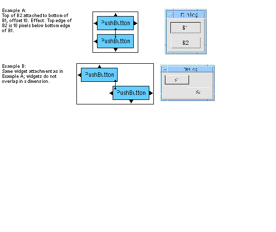
To understand how this works, remember that an attachment affects a widget's position in only one dimension. For example, if you attach the top of Widget 1 to the bottom of Widget 2:
top_1 = bottom_2 + offset
where top_1 represents the y coordinate of the top of Widget 1 and bottom_2 the y coordinate of the bottom of Widget 2. This is true whether or not the two widgets overlap in the horizontal dimension.
 [ D ]
[ D ]
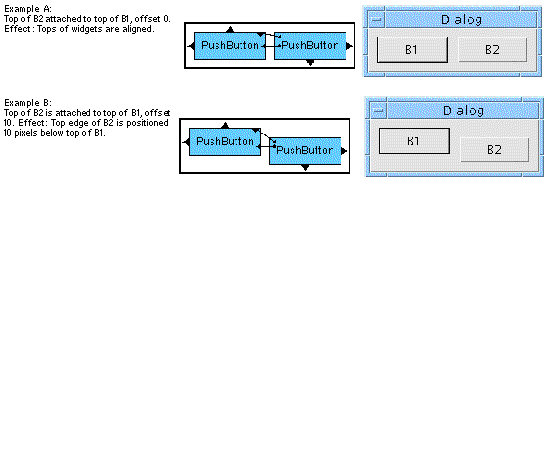
Similarly, if you attach two widgets top to top:
top_1 = top_2 + offset
If the offset is 0, the tops of the two widgets have the same y coordinate; that is, they are aligned.
 [ D ]
[ D ]
Example A of FIGURE 4-16 shows the type of attachment used by the "Align" mode. Example B shows a similar attachment with a non-zero offset. The effect is similar to an alignment but with a step effect.
You can align widgets in pairs using either the "Align" mode or by using the "Attach" mode with a 0 offset to attach their left, right, top or bottom edges. The align buttons in the Layout Menu provide a quick way to align a group of widgets. The attachments set by these are the same kind used to align widgets in the "Attach" or "Align" mode.
These buttons are only enabled if more than one widget is selected. For more details on selecting more than one widget, in particular specifying the primary selection, see Selection: Single, Primary and Secondary.
There are six align functions on the pull-right menu available from "Align" in the Layout Menu. These are:
To see the effects of group alignment:
1. Use "Move" mode or mouse button 2 to move the second ToggleButton back out of alignment.
2. Use "Move" mode or mouse button 2 to move the right ToggleButton so that its right edge is aligned with the right edge of the Frame.
Now align the tops of the three ToggleButtons as a group:
3. On the Layout Editor screen, click on the right ToggleButton.
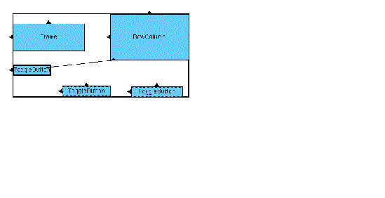
In "Move" mode, widgets are drawn with a thicker border as you click on them to indicate that they are selected. After you click on the first widget, you must use <Shift-Button 1> to add widgets to the selection group. The primary selection is shown with a thick border while all other selections are shown with a dotted border, as in FIGURE 4-17.
 [ D ]
[ D ]
"Align" will align to the primary selection.
4. Click with <Shift-Button 1> on the middle ToggleButton.
5. Click with <Shift-Button 1> on the left ToggleButton.
To align the tops of the ToggleButtons:
6. Select "Align top edges" from the "Align" pull-right menu in the Layout Menu.
This sets the attachments shown in FIGURE 4-18.
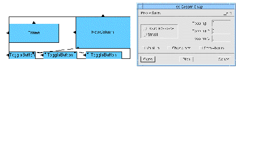
When you align a group of widgets, the last widget selected is unaffected and the others are aligned to it. The order in which widgets are selected does not matter except for the last. X-Designer sets attachments in the order of the widget's spatial positions. Each widget in the group except the last is attached to its neighbor and all attachments point toward the last widget selected. In your layout, the right widget is attached to the center widget, which is attached to the left widget.
FIGURE 4-19 illustrates this general rule. If a group of widgets is selected in the order shown in the first figure, the resulting attachments would connect them in the order shown in the second figure.

This rule works similarly for columns of widgets aligned along their left or right edges.
The distribute functions on the "Distribute" pull-right menu in the Layout Menu let you distribute a group of widgets evenly across a given space. These functions are only enabled if you have more than two widgets selected. See Selection: Single, Primary and Secondary for details on how to select more than one widget.
Selecting the "Distribute" item in the Layout Menu displays a pull-right menu containing two items which are also pull-right menus.
Selecting "Horizontal" displays a pull-right menu with the following items:
Note that the difference between the first two items is most visible when the widgets being distributed are very different in size.
Selecting "Vertical" displays a pull-right menu with the following items:
Note that, as with horizontal distribution, the difference between the first two items is most visible when the widgets being distributed are very different in size.
You can use these functions to distribute the three ToggleButtons evenly across the bottom of the Form.
1. Click on the right ToggleButton.
If widgets are still selected from the previous section, they are deselected when you click on a new widget to start a new group.
2. Click with <Shift-Button 1> on the middle ToggleButton.
3. Click with <Shift-Button 1> on the left ToggleButton.
The three buttons are now all highlighted. The primary selection, indicated by a thick border around the widget, is the last ToggleButton selected. See Selection: Single, Primary and Secondary for more details. However, the order of selection does not matter to the "Distribute" feature.
Distribute the buttons horizontally with equal space between their edges:
4. Pull right from "Distribute" in the Layout Menu.
5. Pull right from "Horizontal" in this second menu.
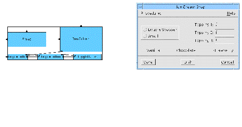
The result is shown in FIGURE 4-20.
 [ D ]
[ D ]
"Distribute" sets attachments in a different order from group align ("Align" in the Layout Menu). With "Distribute", attachments are always made in spatial order from bottom to top or from right to left, as shown in FIGURE 4-21. Each widget is attached to its neighbor. In "Distribute", unlike "Align", the order of widget selection makes no difference.
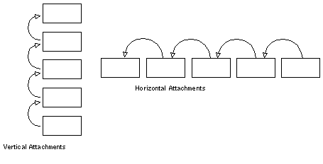
You can see in the Layout Editor screen that the arrows attaching the ToggleButtons edge to edge all point from right to left. It is easier to see the arrows if you pull down the View Menu and temporarily remove class name annotations from your screen.
Because "Distribute" only sets attachments as described above, circular attachments can easily result unless you plan ahead. For example, you can select widgets from right to left, "Align" them and then "Distribute" them, as you have just done. However, you cannot select them from left to right, "Align" them and then use "Distribute" on the same group of widgets. Doing this results in circular attachments.
If you make all other attachments from right to left or from bottom to top, "Distribute" never results in circularity.
The attachments set by "Align" and "Distribute" may also conflict with existing attachments--see Removing Attachments on Move for more details.
Position attachments let you attach an edge of a widget at a position that is a percentage of the Form's total width or height. This capability lets the widgets in your interface take advantage of additional space when the window resizes. Positions are always measured from the top left corner of the Form. If the top or bottom edge of a widget has a position attachment of n%, that edge is positioned n% of the way down from the top of the Form. If the left or right edge of a widget has a position attachment of n%, that edge is positioned n% of the way across from the left edge of the Form.
The position is specified as a percentage value in the "Position" field. If you do not enter a value, X-Designer assumes a value of zero. Position attachments are shown as hollow circles on the attached edge of the widget.
First, demonstrate the current window behavior:
1. Resize the window so that it is wider than the present size.
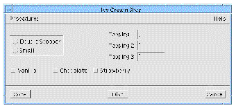
Note that the RowColumn stays at the same distance from the Frame, as shown in FIGURE 4-22.
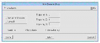
This is the behavior you expect when you set an attachment with a fixed offset. Any extra window width is just unused space. Many interfaces use this resize behavior. However, you can also use a position attachment to make the RowColumn move over to take advantage of available window space.
To do this, specify a 45% position attachment on the left edge of the RowColumn:
2. Click on the "Position" toggle.
3. Double-click in the "Position" box and type: 45
4. Position the pointer just inside the left edge of the RowColumn so that the edge highlights and click.
The position attachment appears as a hollow circle on the edge of the RowColumn, replacing the existing attachment and the arrow that represented it. This type of attachment places the RowColumn's left edge 45% of the distance across the Form, regardless of the window size. To see the effects of this:
5. Resize the window narrower, then wider.
The RowColumn now moves right to fill any extra space, as shown in FIGURE 4-23. This type of resize behavior is the main advantage of position constraints.
 [ D ]
[ D ]
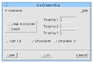
The disadvantage of this type of attachment is that a position attachment is calculated only by the size of the Form and does not adjust to fit the sizes of other widgets. This is a problem if other widgets resize, as shown in FIGURE 4-24. When one of the labels inside the Frame becomes longer, the Frame can get closer to the RowColumn, or even overlap it.
 [ D ]
[ D ]
Compare this behavior to that shown in FIGURE 4-10, where the layout had a widget attachment with a 50-pixel offset. The choice of attachment type is up to you and should be based upon the types of widgets in your layout and any possible changes at run time. Various aspects of layout strategy are discussed further throughout Chapter 20.
The "Self" mode is another way of setting a position attachment. Instead of typing a percentage value, you click on one edge of the widget and X-Designer calculates a percentage based on the widget's present location and the present size of the Form. When you use "Self", you do not have to specify a percentage in the "Position" field and any value that is already in the field is ignored. You must, however, first place the widget where you want it to be using "Move" or one of the other commands.
"Self" works especially well in combination with "Distribute". You have already set up the buttons at the bottom of the Form with a fixed gap between them. By setting "Self" attachments on both sides of each button, you can preserve the evenness of spacing while letting the buttons take advantage of extra window space that may become available.
By default, "Self" attachments snap to the grid. Therefore, in order to take advantage of the precise spacing set by "Distribute", you should disable the grid.
2. Click on the "Self" toggle.
In "Self" mode, positions are calculated relative to the total size of the Form. Since you have been changing the window size, you should:
Resetting the Form calculates its best size based on the attachments currently set on its children.
4. Click on the right edge of the right ToggleButton.
The "Self" attachment appears as a filled circle on the edge of the ToggleButton.
5. Click on the left edge of the right ToggleButton.
6. Click on the right edge, then the left edge, of the middle ToggleButton.
7. Click on the right edge, then the left edge, of the left ToggleButton.
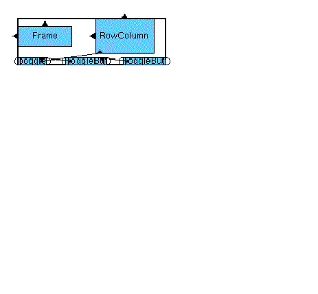
"Self" attachments appear as filled circles. In Motif, however, a "Self" attachment is the same as a position attachment and therefore X-Designer cannot tell them apart after you reset the Form. In this event, "Self" attachments appear as hollow circles and behave exactly like Position attachments. After resetting the Form, the ToggleButtons look as shown in FIGURE 4-25.
This concludes the tutorial portion of this chapter. The rest of this chapter discusses some additional layout features.
"Resize" works like "Move" but sets attachments on the bottom and right side of a widget. To use "Resize":
1. Click on the "Resize" toggle.
2. Using mouse button 1, drag the lower right corner of a widget to the position you want.
"Resize" is useful with BulletinBoards and DrawingAreas if you want to fix the size of a widget. In a Form, "Resize" works by attaching the lower right corner of the widget to a specific x,y location relative to the upper left corner of the layout widget. When combined with attachments on the upper left corner of the widget, this fixes the widget's size. In a BulletinBoard or DrawingArea, "Resize" simply sets the width and height resources of the widget.
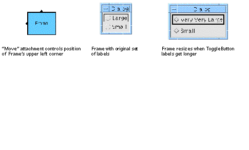
This option is not normally used with Form layouts, because most widgets behave better when you let them calculate their own best size. FIGURE 4-26 shows a typical example of how widgets can resize themselves.
 [ D ]
[ D ]
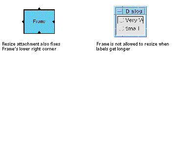
The Frame in FIGURE 4-26 is constrained by a "Move" command only. If the user changes the label text for one of the ToggleButtons, the Frame is free to resize itself because its bottom and right sides are unconstrained.
If the Frame also has attachments set by "Resize", however, it cannot resize, as shown in FIGURE 4-27.
 [ D ]
[ D ]
Because the combination of "Move" and "Resize" attachments shown in FIGURE 4-27 fixes all four sides of the Frame, it cannot subsequently expand to accommodate a larger label. Motif handles this situation by displaying only part of the label string.
"Resize" is used mainly with the BulletinBoard and DrawingArea as these widgets do not offer position attachments or widget attachments. "Resize" offers a way to force widgets to remain at a certain size and prevents them from overlapping. The disadvantage of "Resize" is that it eliminates the positive effects of automatic resizing.
To get the best behavior with widgets that are likely to change size, use a Form and attach widgets to one another so that when one widget changes size other widgets move to accommodate it.
The constraints panel, which was introduced in the previous chapter, can be used to view attachments on any child of the Form and to adjust attachments. The constraints panel is only recommended for viewing or fine-tuning attachments. Note that the constraints panel only shows attachments that originate from a widget. Use the Layout Editor for any large-scale changes.
1. Select "Close" from the File menu on the Layout Editor screen.
2. Select the RowColumn in the construction area.
3. Pull down the Widget Menu and select "Constraints".
This command displays the attachments set on the RowColumn, as shown in FIGURE 4-28.
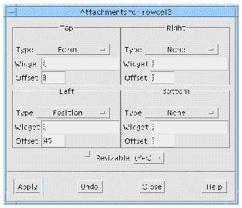
The top edge of the RowColumn has an attachment to the Form with an offset of 0. The left edge of the RowColumn has a position attachment of 45%. The right and bottom edges of the RowColumn have no attachments.
You can use the constraints panel to:
4. To effect any changes in the constraints panel, click on "Apply".
The Layout Editor also works on the BulletinBoard, Drawing Area and RowColumn widgets.
The Layout Editor works in much the same way on the BulletinBoard and DrawingArea as on the Form. There are a few differences when you use it with other layout widgets. The following comments refer only to the BulletinBoard and DrawingArea.
As mentioned above, widget, self and position attachments are not available. The Layout Editor does not show arrows or arrowheads indicating attachments, but only the positions and sizes of widgets in the layout.
When you first display the Layout Editor, you may find that several widgets are initially laid out directly on top of one another. Use "Move" repeatedly to drag them to new positions so that they do not overlap.
The only available editing modes on the main screen are "Move" and "Resize". You can also use "Group Align" and "Distribute" but not the "Align" mode on the main screen. "Group Align" and "Distribute" do not attach widgets to one another, but merely reposition them.
There is no danger of circular attachment as widgets cannot be attached to each other.
Internally, the Layout Editor does not set resources of the BulletinBoard and DrawingArea as it does for the Form. Instead, it determines layout by setting Core size and position resources of the child widgets. The constraints panel is not available for these layout widgets. To view the size and position resources, display the Core resource panel for the child widget.
The RowColumn is a manager widget and, therefore, the Layout Editor can be invoked. The only function you can use, however, is "Resize". None of the others apply to RowColumns.
You cannot move a widget in the layout editor, or set constraints on it, if:
You can manage a widget by setting the "Managed" toggle for it on the Code Generation page of the Core resources dialog.
Copyright © 2003, Sun Microsystems, Inc. All rights reserved.