| C H A P T E R 3 |
|
Resources |
In Motif, the appearance and behavior of a widget is controlled by its resources. Resources include colors, fonts, images and text, titles, positions and sizes of windows or widgets, callbacks, and all other customizable parameters that can affect the behavior of the interface. Resources can have indirect as well as direct effects. For example, changing the label on a PushButton also changes the size of the button to allow space for the new label.
When you add a widget to the design hierarchy, X-Designer sets default values for all of that widget's resources. In most cases, however, you must set some resources explicitly to make the widget useful. To make it easy to set these resources, X-Designer groups resources on dialogs called resource panels.
There are two types of resource panel--"Widget" and "Core". The Widget resource panel contains resources relevant to the class of the selected widget. The Core resource panel groups together resources which apply to all classes of widget because they apply to the base classes--Core, Primitive and Manager. All widget classes are derived from the Core class and most are also derived from either the Primitive or the Manager class. The Core resource panel is described in Core Resource Panel.
When you generate source code for your design, you can also choose to generate an X resource file. This is a separate file containing resource settings which may be altered by the end user. See Setting up the X Resource File for details on resource files and their generation. As well as allowing you to control which resources should be generated into the resource file, X-Designer also provides loose and tight bindings which give you greater control over the way in which resources are assigned to the widgets in your design. This is described in Resource Bindings.
In this chapter, you will use resource panels to:
In addition to resource panels, X-Designer offers special editors for laying out widgets in a Form, setting fonts and pixmaps, editing XmString (Motif compound string) structures and selecting colors. See Chapter 4 for a full description of the Layout Editor, and Chapter 5 for descriptions of the font, color, pixmap and compound string editors.
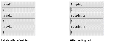
To make the tutorial interface meaningful, you must set the text of all labels and buttons to something other than the default. Begin by changing the three labels in the RowColumn widget to the text shown in FIGURE 3-1.
 [ D ]
[ D ]
First, bring up the resource panel for the first label:
1. Double click on the first Label under the RowColumn widget.
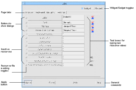
When you double click on the Label, X-Designer displays its resource panel, as shown in FIGURE 3-2.
 [ D ]
[ D ]
Resource panels usually have several pages. Tabs along the top of the window allow you to select the different pages.
If the "Display" page is not already selected:
2. Select the "Display" page by clicking on the tab labelled "Display".
Now edit the text of the label.
3. Double-click in the text box opposite "Label".
Editing text in these boxes works in much the same way as assigning widget names. When you double-click, the first word in the box is highlighted. Triple-clicking highlights all the words in the box. Entering new text replaces the highlighted text.
5. Click on the "Apply" button at the bottom of the resource panel.
The "Apply" command sets the new resource value. When you click on "Apply", the dynamic display shows the new label text.
|
Note - If your locale is not the default "C" and you are using international text in your labels, the text will not appear correctly until you have set up the fontlist resource required for your particular language. See Setting the Application Font Resource for more information. See Chapter 22 if you are not sure whether this applies to you. |
Although different classes of widgets have different resource panels, all resource panels have the same basic structure.
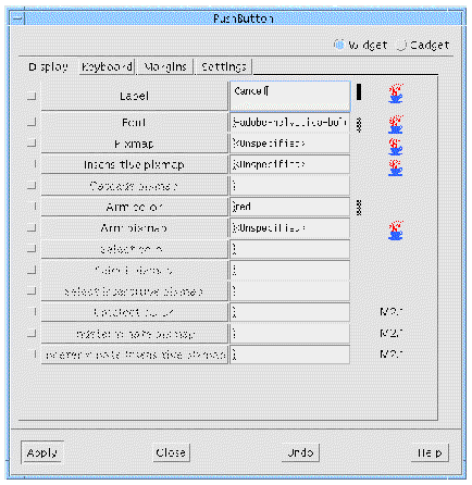
As you change resources, a change bar appears at the far right of the resource panel, as shown next to the "Label" resource in FIGURE 3-3.
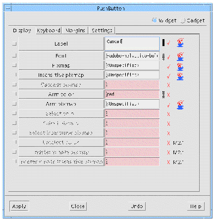
After pressing "Apply", the change bar alters in appearance to that shown next to the "Font" resource in FIGURE 3-3.
Resources which will be honored in Java code have a picture of a steaming coffee cup next to them in the resource panels, as shown in FIGURE 3-3. The same symbol with the string "1.2+" over it indicates that the resource can be mapped to the property of a Swing component. When you generate Swing code, you can decide which version you wish to generate. For more information on using X-Designer for Java code generation, see Chapter 10.
|
Note - If X-Designer cannot allocate enough colors for its icons it will use the letter `J' to indicate Java resources. |
The tick and cross symbols shown in FIGURE 3-3 will only appear when running in Microsoft Windows mode. The tick indicates that the resource is applicable to Microsoft Windows and the cross indicates that it is not. This is explained more fully in Visual Compliance Indicators.
The string "M2.1" indicates that the resource is only applicable in Motif version 2.1 and is not generated if you choose an earlier version of Motif from the options in the Generate dialog.
Tooltips are displayed for the annotations when you hold the mouse pointer over them.
Resource names are shown on the left of a resource panel. Sometimes these names are simply labels and sometimes they are buttons which, when pressed, display a dialog relevant to the resource type. In FIGURE 3-2 above, all the resource names are buttons. Any resources that do not apply to the selected widget are grayed out.
Current resource values are shown in the boxes on the right. These boxes are either single-line text fields, multi-line text boxes or menu options. You can edit resource settings by typing into these boxes or selecting from an option menu. Default values are shown in parentheses.
The unlabeled toggle to the left of each resource name is the resource masking toggle which can be used at the code generation stage to mask resources in or out of the X resource file. This topic is discussed in Masking Resources. You do not have to set these toggles in order to set resource values.
The main section of the resource panel usually has several pages. The tabs at the top of the resource panel window let you move from one page to another. The Label panel also has a toggle switch which can be used to designate this widget as a gadget. The widget-gadget toggle appears in the resource panels for other widget classes if the widget class has a gadget counterpart. Some widget classes also have other toggle switches appropriate to the class.
The four buttons at the bottom of the panel offer general commands. "Apply" causes your new resource settings to take effect. If you do not click "Apply", your edited settings are lost when you select another widget or close the resource panel.
"Undo" makes all edited settings revert to the last applied settings. "Close" makes the resource panel disappear. "Help" displays the appropriate help screen.
Note that in FIGURE 3-3, the "Apply" button is highlighted. Pressing <Return> when a resource panel has the input focus generally executes the highlighted command. However, <Return> does not work in this way when you type into a multi-line text box, because the text box accepts <Return> as a newline character.
Now set the text of the other two Label widgets. You do not have to close the Label resource panel. However, you may need to move it if it covers the construction area.
1. Select the second Label widget.
Note that the "Label" resource on the panel changes to reflect the current setting of the newly selected widget.
2. Double-click in the "Label" box in the resource panel to highlight the default label.
Additional ways to edit in text boxes include: dragging with the mouse to highlight text, using <Delete> to delete highlighted text, or just typing at the current cursor location.
5. Repeat Steps 1 through 4 for the third Label, using the text: Topping 3:
"Close" makes the resource panel disappear.
If you have more than one widget selected you can still set resources--in both the core and widget resource panels. In this case you will only be able to set those resources which are relevant to all the selected widgets. X-Designer decides which resources are relevant by finding a widget class which is common to all the selected widgets. In the case of widgets which are very different, for example a Button and a MenuBar, the only class they have in common is the low-level Core widget class. In such a case, you would only be able to change Core resources.
You can also apply the resource file masking toggles to multiply selected widgets. This toggle can be in one of three states: on, off and mixed. If all of the selected widgets have the same setting for this toggle, it shows on or off, as appropriate. If they have different settings, however, it shows the mixed state. More information on the function and purpose of these toggles is given in Masking Resources.
When X-Designer is running in Microsoft Windows mode, it makes sure that the design you are creating is Microsoft Windows compliant. Motif resources do not map directly to Microsoft Windows resources. Some resources can be translated into something similar on Microsoft Windows (which may not necessarily be a resource), some cannot.
Resources are marked in the resource panels, according to their relevance to Microsoft Windows, in two ways:
Resources which are not applicable to Microsoft Windows have their fields colored pink in the resource panel and are annotated with a cross icon. You can still enter values into these fields and they will be generated for Motif, but nothing will be generated for Microsoft Windows. You can change the color of these non-Microsoft Windows resource fields by changing an entry in the X-Designer application resource file. See Setting the Color of Non-Microsoft Windows Resource Fields for details on how to do this.
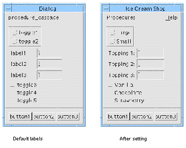
Use the same procedure as that used for the Label widgets to set the labels of ToggleButtons, CascadeButtons and PushButtons. Set labels for the ToggleButtons in the work area as shown in FIGURE 3-4.
 [ D ]
[ D ]
1. Double click on the first of the set of three ToggleButtons to display its resource panel.
You can also display the selected widget's resource panel by selecting the "Resources" item in the "Widget" Menu, by pressing the Resources toolbar icon or by pressing <Return> when the widget has the input focus in the construction area.
2. Click twice in the "Label" box and type: Vanilla
4. Select the second ToggleButton.
5. Click twice in the "Label" box and type: Chocolate
7. Select the third ToggleButton.
8. Click twice in the "Label" box and type: Strawberry
Notice that the resource panel for a ToggleButton looks the same as for a Label. This is because, in Motif, the ToggleButton widget class is derived from the Label class. Another way of saying this is that the ToggleButton is a specialized kind of Label, also called a subclass of Label. The Label is the ToggleButton's superclass.
The ToggleButton class inherits most of its characteristics, including most of its resources, from the Label class. By means of inheritance, all Motif widget classes are organized in a hierarchy known as the class hierarchy. The class hierarchy is an abstract hierarchy of available widget classes and should not be confused with the design hierarchy you are building on the screen.
Several types of buttons--ToggleButtons, PushButtons, CascadeButtons and DrawnButtons--are derived from the Label class. You can set the text of all widgets of these classes using the same resource panel without having to close and re-open it.
Set labels for the radio buttons (the ToggleButtons in the RadioBox) as shown in FIGURE 3-5.

1. Double click on the first toggle on the RadioBox to bring up its resource panel.
2. Click twice in the "Label" box and type: Large
4. Select the second radio button.
5. Click twice in the "Label" box and type: Small
If you assign a label to the radio button which is longer than the default label, the Frame widget changes size to accommodate the new width. This represents a chain reaction: the ToggleButtons resize to accommodate longer text strings, then their RadioBox parent and its Frame parent resize to fit in turn. Motif does all this automatically. This behavior is not obvious in the tutorial layout but it is illustrated in FIGURE 3-6.

Use the same Label resource panel to set the label resources of the CascadeButtons as shown in FIGURE 3-7.

7. Select the first CascadeButton and assign it the label: Procedures
8. Select the second CascadeButton and assign it the label: Help
Finally, set the labels of the three PushButtons in the button box, as shown in FIGURE 3-8. PushButtons also resize automatically to accommodate their labels.
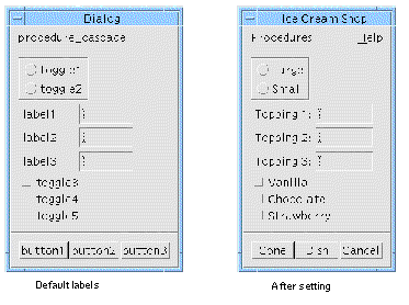
9. Select the first PushButton and assign it the label: Cone
10. Select the second PushButton and assign it the label: Dish
11. Select the third PushButton and assign it the label: Cancel
|
Tip - Remember to click on "Apply" after setting resources, or your new settings will have no effect. If you do not apply your new settings before selecting another widget (or closing the resource panel), X-Designer displays the warning shown in FIGURE 3-9. |
 [ D ]
[ D ]
Click "Cancel" on this display to return to the resource panel.
Next, set resources for the buttons in the pulldown menus of the menu bar. So far you have set only the CascadeButton labels and the pulldown menus look like FIGURE 3-10.

1. Select the first PushButton child of the first Menu widget.
2. Change the "Label" resource to: Wash Dishes...
By convention, the ellipsis (...) is used to indicate that a menu item brings up an additional dialog box before the command is executed.
3. Select the second PushButton and assign it the label: Count Money
4. Select the third PushButton and assign it the label: Exit
5. Select the PushButton child of the second Menu widget.
6. Assign it the label: About This Layout...
The pulldown menus now look like FIGURE 3-11.

In the following sections, you will:
Accelerators and mnemonics are keyboard resources which are found on a separate page of the Label resource panel. Use the following steps to set an "H" mnemonic on the "Help" CascadeButton:
1. Select the "Help" CascadeButton.
2. Select the "Keyboard" page by clicking on the tab labelled "Keyboard".
This displays the "Keyboard" page, shown in FIGURE 3-12. The resources that are not grayed out are the ones which apply to the CascadeButton class.
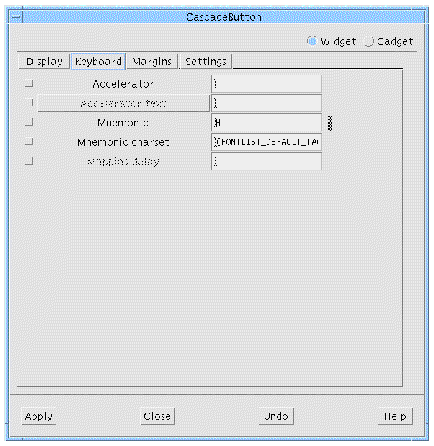
X-Designer lets you set keyboard mnemonics which work like those in the X-Designer interface. A mnemonic can be any character, even one which is not in the label. It is easiest for the end user if you use a character which appears in the label, preferably the first character. Mnemonics must be unique within a menu bar or menu.
1. Double-click in the "Mnemonic" box.
4. Select the PushButton child of the "Help" menu.
5. Double-click in the "Mnemonic" box.
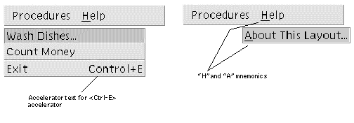
Note that the "H" and "A" characters now appear underscored, which is Motif's way of indicating a mnemonic. This lets the user invoke the "About This Layout" command in two ways: with the mouse, or by pressing <Meta-H>, <A>.
You may have to reset the widget in order for the mnemonic to show in the dynamic display. Do this by checking that the Cascade Button is still selected and either pressing the Reset button on the toolbar or choosing "Reset" from the Widget menu.
Now add the keyboard accelerator for the Exit button. As in X-Designer, an accelerator immediately executes a menu command, whether or not the menu is displayed.
1. Select the "Exit" button (the third PushButton under the first pulldown Menu).
2. Double-click in the "Accelerator" box.
3. Type the text string: Ctrl<Key>E
These steps make the accelerator active. When the interface is running, <Ctrl-E> will have the same effect as the "Exit" button. The exact syntax of the accelerator is important. If a syntax error occurs, X-Designer displays the error message shown in FIGURE 3-13 when you try to apply.

Accelerator syntax is the same as that used for translation tables. This topic is discussed in Translations and Actions.
A related resource is accelerator text. This resource displays extra text to the right of a menu option to remind the user of its accelerator. Since accelerator text is just a display convenience, you do not have to use any particular syntax. "Control+E", "Ctrl-E" and "^E" are some common forms.
1. Double-click in the "Accelerator Text" box.
2. Type the text string: Control+E
When you pull down the left menu, you now see the new labels on all the buttons and the designated accelerator text on the Exit button, as shown in FIGURE 3-14.
 [ D ]
[ D ]
The Motif Style Guide suggests designating one CascadeButton child of the MenuBar as the Help widget. The Help widget always appears at the right end of the menu bar.
1. Double click on the MenuBar to bring up its resource panel.
The MenuBar is a specially configured RowColumn and shares its resources. The resources that are not grayed out apply to the MenuBar.
2. Select the "Display" page if not already selected.
3. Double Click in the "Help widget" field and type: help_cascade
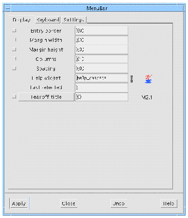
The Help widget must be one of the CascadeButtons in the menu bar. You must type the CascadeButton's variable name exactly. If you make a mistake, X-Designer does not accept the entry.
To see the effect of designating the Help widget, resize the dynamic display wider. The Help widget always stays at the far right of the menu bar.
Leave the MenuBar resource panel open.
By default, the RowColumn widget has one vertical column. Its resources can be set to change it from this default state to an arrangement of three horizontal rows, as shown in FIGURE 3-16.
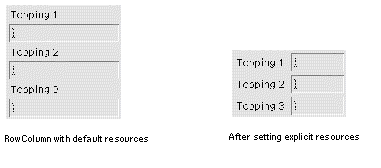
To achieve the result shown in FIGURE 3-16, you must also set the size of the TextFields.
1. Select the three TextField widgets in the hierarchy.
You can do this by selecting one widget and then holding down the Shift key while selecting the other two. You can drag a rectangle around widgets which are next to one another in the design hierarchy. This selects all widgets inside the rectangle.
Note that when you select a TextField widget, the MenuBar resource panel, which is still present on the screen, becomes inactive. Its "Apply" button is grayed out and if you try to type into its text fields, your machine beeps. The panel becomes active again whenever a widget of the same base class (RowColumn) is selected.
2. Display the TextField resource panel and select the "Display" page.
Invoke the resource panel by double-clicking over one of the TextFields, selecting "Resources" from the "Widget" menu or pressing the Resources toolbar icon.
The TextField is a variant of the Text widget and shares many of its resources. The distinction is that Text widgets can contain multiple lines of text, while TextFields are limited to a single line. Because these classes have no gadget counterparts, this resource panel has no widget-gadget toggle. There is, however, a toggle to change the widget from TextField to Text. This toggle lets you change from one variant of the Text widget to the other without disturbing your hierarchy or resource settings.
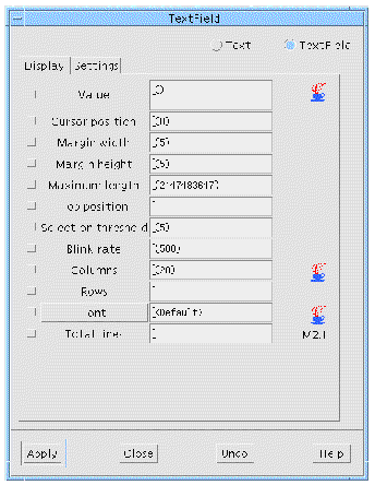
We want to make the text field boxes narrower. The size of the text field boxes is determined by two factors: the TextField's "Columns" resource and the rules imposed by its RowColumn parent. Begin by setting the "Columns" resource to a smaller number:
3. Double-click in the "Columns" box.
The TextFields are now narrower.
The "Columns" resource of a TextField or Text widget only affects the size of the box and not the number of characters the user can enter. If you want to limit input to a specific number of characters, set the "Maximum length" which defaults to a very large number.
To get the layout of three horizontal rows, you need to set the resources of the RowColumn.
1. Select the RowColumn widget in the construction area.
If you already have the MenuBar resource panel up on your screen, it becomes active again although its title is changed to "RowColumn". If it is not on the screen, display it by double-clicking on the RowColumn again.
2. Select the "Settings" page.
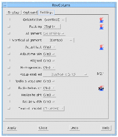
The "Settings" page, shown in FIGURE 3-18, lists resources that have a limited number of possible settings. Therefore, it has option menus instead of text fields in its right column.
3. In the "Orientation" option menu, select "Horizontal".
4. In the "Packing" option menu, select "Column".
"Horizontal" orientation lays the RowColumn out in rows rather than columns. "Column" packing is necessary if the RowColumn is to have more than one row or column. To see the effect of these two resources:
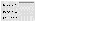
At this point, the RowColumn appears in a horizontal row, with all the cells the same size. When "Orientation" is "Horizontal", the sense of rows and columns is reversed. Therefore, to make three rows you must set the "Columns" resource.
7. Double-click in the "Columns" box and type: 3
The result is shown in FIGURE 3-19.
The Shell widget exists primarily as an interface between your application and the X window system. Its behavior is mainly controlled by the window manager and by the widgets it contains. However, it does have a few interesting resources of its own.
 Double click on the Shell widget, myFirstShell, to bring up its resource panel.
At the top of this panel is a toggle switch which sets the type of Shell widget. Although there are four Shell widgets on the widget palette, they are actually the same but with this toggle set differently.
Although every window starts with a Shell widget, there are different types of windows and different types of Shell widgets. X-Designer provides the following Shell widgets, as shown in FIGURE 3-20:

All windows in the design close when the main application shell is closed.
To see some possible uses of different Shell types, look at the X-Designer interface itself. The main screen with the widget palette and construction area is the Application Shell. Dialogs, resource panels and the Layout Editor screen are all Dialog Shells. You cannot iconify these windows separately using the window manager.
To remove them from the display, you must close them, either using the window manager or by clicking on a "Close" button, which closes the window internally via an "Activate" callback. All open Dialog Shells disappear when the main window is iconified and reappear when it is restored.
The "Palette Icons" help panel is an example of a Top Level Shell. While it does not come up automatically when X-Designer starts, it can still be iconified independently once you have displayed it. Its popup subwindows, like all Dialog Shells, are children of the main Application Shell and do not close or iconify with the "Palette Icons" help panel.
The Shell type is not reflected in the dynamic display. All windows created for dynamic display are really Dialog Shells and cannot be iconified independently. You can configure X-Designer to use Top Level shells rather than Dialog Shells--see Appendix E for details. The generated code creates the type of Shell you specify for each window at run time.
You should have at least one main application shell in each design. This can be an Application Shell if you are using a version of Motif earlier than Motif 2, otherwise this should be a Session Shell. If you have no main shell in your design, the application will not display any windows. X-Designer shows you a warning message at code generation time if you do not have a main application shell.
You can have more than one main application shell in your design. In this case, the main() program generated by X-Designer creates all the Application Shells or Session Shells but displays only one of them. X-Designer cannot tell which one you want displayed first. If you have more than one main application shell in your design, you may have to write your own main() program or edit the generated one to start with the correct shell. To get similar results without ambiguity, use only one main application shell for your first window, use Top Level Shells for other primary windows and use callbacks or links to display all windows but the first. Using more than one main application shell is not recommended.
Every application must have at least one (and usually only one) Session Shell (or Application Shell for earlier versions of Motif) which serves as the main window and as the interface of the application to the X window system.
Subsidiary windows can be either Dialog Shells or Top level Shells. This distinction is explained more fully in Shell Types.
The main Shell in your design, myFirstShell, is a Session Shell. You just need to change its title:
1. Display the Shell`s resource panel, if it is not already displayed.
3. Double-click in the "Title" box and type: Ice Cream Shop
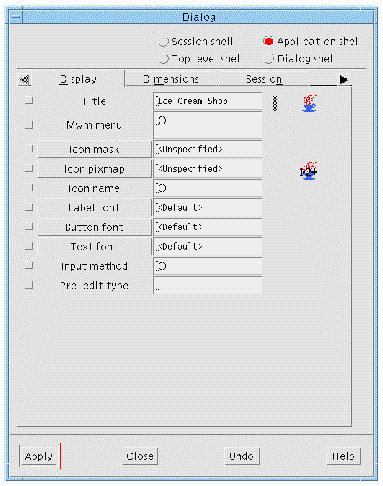
The layout now looks like FIGURE 3-22.
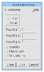
In your application, you have another Shell for the Help window. This Shell is a Dialog Shell. You need to change the title of this window.
1. Double click on the Shell for the Help window.
3. Double-click in the "Title" box and type: Help
Because Motif has so many resources, X-Designer uses multiple-page resource panels to display them on the screen. You may find it useful to refer to Chapter 27 while you are becoming familiar with the structure of the resource panels. That chapter has a list of resources by widget class and page.
Some resources that are not available on the resource panel of a specific widget class can be found on the Core resource panel, which is discussed in Core Resource Panel.
In general, any multiple-choice resource--one with a limited number of settings--is found on the "Settings" page, where you can set it with an option menu. All other resources that require you to type in a new value or call an additional dialog to set the new value are divided among the other pages. Except for the "Settings" page, resources are organized loosely by topic.
Resources that affect the widget's appearance are generally found on the "Display" page. These resources include text, colors, fonts and dimensions. The Core resource panel also includes some resources that affect the dimensions and the location of the widget.
Labels and Label derivatives have enough display resources to require a second page. The Label resource panel divides these resources into a "Display" page, containing color, font, text and pixmap resources, and a "Margins" page, containing size and margin width resources.
The "Keyboard" page lets you set keyboard mnemonics and accelerators for widgets that can have them.
X-Designer gives you access to resources for these broad superclasses via a single resource panel, the Core resource panel. To display the Core resource panel for a specific widget:
2. Pull down the Widget Menu and select "Core resources...".
A page from the Core resource panel is shown in FIGURE 3-23.
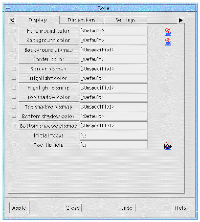
The "Display" page of the Core resource panel has basic color and pixmap resources. For example, you can set the colors for the widget's foreground, background, highlighting and shadows. You will do this in Chapter 5.
The Tooltip help resource on the Core resource panel display page allows you to add context sensitive help tips for any widget but not gadgets. This type of help becomes visible in a small popup window when the mouse passes over the widget.
Tooltip help is provided by X-Designer, not Motif. The generated code needs the tooltip library in order to compile. This is found in:
where XDROOT is the installation directory of X-Designer. There is a text "README" file in the tooltip directory for more information. The default Makefile generated by X-Designer automatically links in the tooltip library.
The "Dimensions" page offers resources that affect the widget's size and location on the screen. Class-specific dimension resources may override the settings on the Core panel. You may want to experiment with the effects of setting "Shadow thickness" on a TextField or "Highlight thickness" on a PushButton.
The "Settings" page offers miscellaneous multiple-choice settings which apply to most widget classes. This page also allows you to change the "Map when managed" setting, which works in conjunction with the managed toggle, described below.
The "Code Generation" page gives you increased control over the generation of code. For example, you can designate a specific widget as static, local, or global. See Accessing Widgets in Callbacks for a reason to change a widget`s access. If you are using C++, you can also designate it as private, protected, or public. Widget Member Access Control discusses C++ access. The "Code Generation" page also allows you to create your own derived C++ classes. This subject is described in detail in C++ Classes.
The managed toggle also appears on the "Code Generation" page. By default all widgets are generated as managed, with the exception of the "Apply" button in a SelectionBox that is not a child of a Dialog Shell. This state can be modified using the "Managed" toggle in the "Code generation" page of the Core resource panel. Usually this just means that the code to manage the widget is omitted from the generated code. For widgets or gadgets that are components of composite widgets, the generated code explicitly unmanages the widget if the toggle is off, since the toolkit always creates these widgets as managed. For the "Apply" button of a Selection Box, code to explicitly manage the button is generated if the toggle is on. See Manipulating Widgets for more information on widget manipulation.
The toggle labelled "Include in Resource Bindings" refers to the generation of resources for the selected widget. This is explained in full in Tight Bindings.
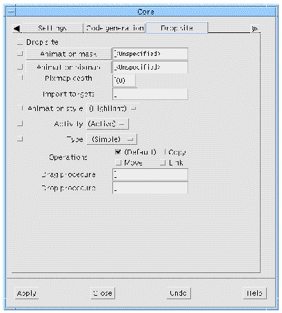
This is where you can specify a drop site. A drop site is a widget that is prepared to receive certain types of data from other widgets by means of the drag and drop mechanism introduced in Motif 1.2. Drag and drop allows you to pass information between widgets by selecting the data and dragging it using the mouse.
The initialization of a drag is a dynamic function that would normally be done from within a callback or action function. X-Designer provides simple support for the reception of a drop but not for the source of a drag.
For details on how to set up a widget as a drop site, see Drag and Drop.
Motif has two classes of widget, the PanedWindow and the Form, which are called constraint widgets. Widgets of these classes have a special set of resources, called constraint resources, that control the size and position of their children. A constraint widget maintains a separate set of constraints for each of its children. X-Designer lets you set them as if they were resources of the children.
To view constraint resources for any child of a constraint widget:
1. Select a child of a constraint widget (i.e. a child of the form).
2. Pull down the Widget Menu and select "Constraints...".
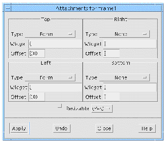
FIGURE 3-25 shows the default constraints resource panel for the Frame child of the Form in the tutorial layout. This panel shows that the Frame's top is attached to the top of the Form and its left side is attached to the left side of the Form, with an offset of 0 pixels. This is why it is located at the upper left corner of the Form. The bottom and right side of the Frame are unconstrained.
The constraints resources which the Form imposes on its children interact in complex ways and the preferred way of setting them is by using the interactive Layout Editor, which is discussed in Chapter 4. The constraints resource panel is mainly useful for viewing the constraints which have been set, as an adjunct to the Layout Editor. Advanced users may want to set values on the panel itself. This can be done as with any other resource panel, by typing in the new value and clicking on "Apply".
The constraints resource panel for children of the PanedWindow displays a different set of values. This panel is discussed in the section on the PanedWindow in Chapter 27.
You may have noticed that X-Designer displays default resource settings in parentheses. Default settings are different from explicit settings, even if the values are the same when you build the interface. The difference is that default settings are not added to the generated code or X resource files. If your interface uses default settings, and is then run on a machine other than the one used to design it, it will use the Motif defaults for the machine on which it is running.
Many resources, such as the label on a PushButton or the number of columns in a RowColumn, are unlikely to cause portability problems. Others, such as dimensions and colors, are machine-specific. To make your interface portable, you must either use default values for such resources or put them into an X resource file at the time of code generation so they can be edited for each machine. This is discussed in Setting up the X Resource File.
FIGURE 3-26 shows a resource panel with some resources which have been explicitly set either in the current X-Designer session or in a previous one. The explicit settings are those marked with a change bar.
To revert to the default setting for a resource for which you have entered an explicit setting:
1. Delete all text in the resource's text field on the resource panel.
To select the default value for a resource on the "Settings" page:
3. Select the option displayed in parentheses from that option menu.
When you set any resource, X-Designer tries to apply that value to the selected widget in your dynamic display. Note that what you see in the dynamic display is a collection of widget instances. X-Designer does not draw pictures of widgets but actually creates them, using the same Motif function calls which your interface will use when it is running. When X-Designer sets a resource, it makes the appropriate Motif function call to set that resource's value for that widget.
Usually, the result of setting a value is the same as creating the widget with that value in the first place. However, this is not always the case. X-Designer has a command on the Widget Menu, "Reset" (<Ctrl-T>), which destroys the selected widget and its children and recreates them with the most recently applied resource settings. If your layout does not look or behave as expected, try using the "Reset" command. The following steps demonstrate a case where "Reset" is required:
1. Double click on the "Help" CascadeButton widget in the hierarchy to bring up its resource panel.
2. Select the "Keyboard" page.
3. Remove your previously set mnemonic by deleting all text from the "Mnemonic" text field.
Notice at this point that the "Mnemonic" text field reverts to the <Default> setting. However, the "Help" button in the dynamic display still has an underscore under the "H", indicating a mnemonic which is no longer present. To update the display:
5. Select "Reset" from the Widget Menu.
Resetting only affects the selected widget and its children. Resetting a widget that is low in the hierarchy may leave inaccuracies elsewhere in the dynamic display. If you set many resources, it is wise to reset the Shell to guarantee that what you see is what you get.
The "Reset" command is particularly useful when using the Form widget and its attachment resources. This topic is discussed in Chapter 4.
Motif and other widget toolkits have rules which control legal settings of resources and, since X-Designer works with real instances of widgets and not simulations, any new resource setting that does not satisfy these rules is rejected. The rules include valid values for the particular widget, requirements of a parent widget such as a RowColumn and requirements of the machine you are using to build your design.
For example, if you are designing an interface for use on a large-screen workstation, you might want to set a dimension resource to a large number of pixels. If you are designing on a smaller-screen machine, you may find you cannot set the value you want even though the interface will run on the large-screen machine later. (In this situation, you could still set the width you want by using an X resource file.)
When Motif rejects a new resource setting, it does not revert to the previous setting but calculates a new value based on defaults and other resource settings in the hierarchy. This new value is reflected on the resource panel and in your dynamic display.
X-Designer provides a mechanism for adding your own resources, called custom attributes. When these are added to a widget which becomes a definition, they are inherited by instances of the definition. For instances, a separate dialog allows you to override the original value assigned to this attribute.
To define a custom attribute, select the widget in the design hierarchy and then choose "Custom attributes" from the Widget menu. The dialog shown in FIGURE 3-27 appears.
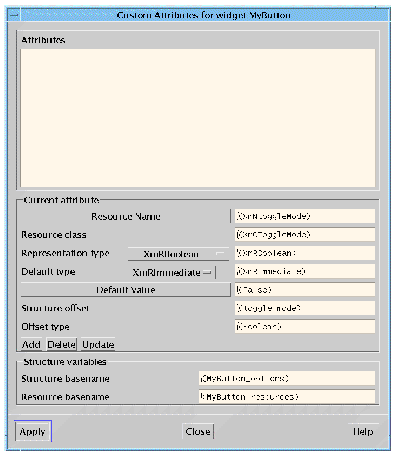
There are three sections to this dialog:
In all cases, except the name, you can use the defaults provided by X-Designer.
For an instance of a definition, you may wish to override the value set for a custom attribute. Do this by selecting "Override attributes" from the Widget menu. The dialog shown in FIGURE 3-28 appears.
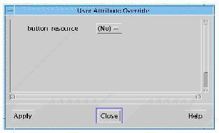
The dialog lists all of the attributes inherited by the instance and allows you to change their values as necessary.
When you create definitions you may wish to restrict which resources users of the definition are able to alter. By doing this, you can be sure of maintaining a pre-determined style or behavior. Select "Resource restrictions" from the Widget menu to display the Resource Restrictions dialog, shown in FIGURE 3-29.
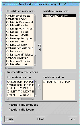
The dialog shows two lists of resources - restricted and unrestricted. Select resources in either list and use the arrow buttons to move them to the other list. For enumerated types, you can restrict individual members of the enumeration. Select the enumeration resource from the "Restricted" list. The elements of the enumeration are displayed in the list below. You can then move individual enumeration elements between the restricted and unrestricted lists.
Previously in this chapter you have seen how to set resources for individual widgets. Setting up the X Resource File describes how X-Designer can generate a resource file which contains all the resources you have set in the design.
The way resources and widgets are tied together is often referred to as a binding. One line is generated for each resource which has been explicitly set and which you have asked to be generated into a resource file. See Resource File Syntax for a description of the format of resource files. Code Generation Options shows how you can tell X-Designer which resources to generate into the resource file.
There are two methods of setting resources in X-Designer:
Which method you choose depends on the number of widgets you wish to use a resource. In large designs you may want all widgets of a particular class to look the same (all buttons to be green, for example). Loose bindings provide the means of doing this. Resources which apply to individual widgets should be set using the resource panel.
Tight bindings are a way of avoiding conflicts in an application's resource file. This is explained in more detail in Tight Bindings.
Setting a loose binding lets you specify a default resource that will be used if no explicit resource has been set. The loose bindings dialog allows a lot of flexibility because widgets can be referred to by their widget name, their class name or even by a wildcard indicating that any widget fitting the description is applicable. You can also specify how general to make the binding. This is explained in more detail in the example below. Loose bindings are useful if, for example:
You can achieve this by setting up loose bindings. This can be explained with a simple example.
1. Create a widget hierarchy containing a TopLevel Shell, a Form, another Form and three PushButtons, as shown in FIGURE 3-30.
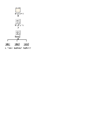
2. Name the Shell "MyShell" and one of the Forms "MyForm", as shown.
For resources, the widget name is the name that will be used. Setting the variable name, however, automatically sets the widget name using the same name.
3. Select the Shell, the Form named MyForm and the first Button.
Select one and then hold the Shift key down while selecting the others.
4. Select "Loose bindings" from the "Widget" menu.
The Loose Bindings dialog appears.
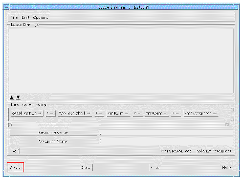
The Loose Bindings Dialog, shown in FIGURE 3-31, consists of the following areas:
This contains three menus: "File", "Edit" and "Options". The "File" menu contains commands to Load, Merge and Inherit bindings from external resource files. These operations are described in more detail in Resources From External Resource Files. The "Edit" menu allows you to delete bindings as well as cut, copy and paste them. The cut and paste mechanism is important because the order of the bindings in the list is the order they are generated. The order of resources in the resource file is significant because the file is read in order by the X toolkit. If there are any conflicting resources, the later resources override previous ones. The "Options" menu contains one option "Use Inherited Bindings" which allows you to decide whether or not to use any inherited bindings which appear in your loose bindings list.
At the top of the window is the list of currently defined loose bindings. Beneath the list there is an up and a down arrow button. Use these to change the order of the bindings in the list. The order in which the bindings appear in this list is the order they are generated into the resource file.
Underneath the list of existing bindings there is a scrolling window of option menus representing a binding for the selected widgets in the widget hierarchy.
Beneath the representation of the binding there are two text boxes--one for the name of the resource and one for its value.
At the bottom of the dialog there are buttons to bring up the core and widget resource panels. The resource panels relate to the bottommost widget that you have selected in the widget hierarchy (also known as the leaf widget). There is also a button to "Add" the binding to the list of those currently defined.
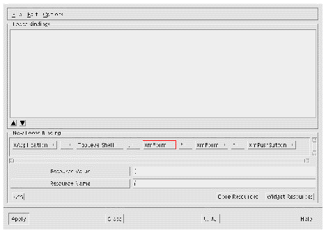
1. Change the option menus in the Loose Bindings dialog so that the Shell and the Form are referred to by name ("MyShell" and "MyForm" respectively) and check that an asterisk separates each widget reference.
This shows a binding which refers to the Shell and one of the Forms by name but to the button by its Motif class name. This means that the binding refers to all the buttons below the named Form. In between each widget, we have selected the asterisk (*), to indicate that there can be other widgets between the named ones. The other Form is included in this way.
The Button widget resource panel is displayed.
3. Set the Label resource to: Bound. Press "Apply" and close the resource panel.
The "Resource Name" text box now contains the text "labelString" which is the name for the Label resource recognized by X Windows. The "Resource value" text box contains the text "Bound" which is the value you typed into the resource panel. The following line is added to the loose bindings list:
XApplication*MyShell*MyForm.XmPushButton.labelString: Bound
When you next generate a resource file this will appear in it. In plain English this means:
All Push Button widgets which are children of Forms named "MyForm" which are descendants of Shells named "MyShell" (with any number of widgets in between) which are in an application of class "XApplication" will have their Label set to "Bound".
The Loose Bindings dialog "File" menu contains three items:
Selecting either "Load" or "Merge" produces a File Selection Box prompting you for the name of a resource file. Selecting "Inherit Bindings" from the "File" menu displays the "Inherit Bindings" dialog.
The Inherit Bindings dialog contains two areas: a text box and button allowing you to specify the name of the resource file from which to inherit bindings and a list of bindings from the last specified file. This is a read-only list. Pressing the button labelled "Resource File" displays a File Selection Box where you can locate a resource file.
In order to inherit the bindings displayed in this dialog, set the "Use Inherited Bindings" toggle in the "Options" menu.
When you next generate a resource file, if the toggle button in the "Options" menu is set, a reference to the named resource file is generated. This, in effect, inherits all the resources listed in the Inherit Bindings dialog. You can unset the "Inherited Loose Bindings" toggle if you no longer wish to inherit resources. If you unset the toggle button, no resource bindings are inherited.
The example illustrated in Example Loose Binding is a simple one. You have more ways of altering the resource binding in the Loose Bindings Dialog. Each element in the binding currently being defined can be altered by means of the corresponding option menu, as shown in FIGURE 3-33.
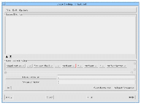
You can refine the binding using these option menus. There are three types of refinement that can be made:
In between each widget name there is a wildcard character. This can be either a period (.) or an asterisk (*). Period means that the widget on the right is a direct descendant of the widget on the left. Asterisk means that there can be any number of other, unnamed widgets in between the widget on the left and the right.
There are three ways of referring to widgets. You can select the Motif class name (e.g. XmPushButton for buttons, XmForm for Forms etc.), the widget name you have specified or a question mark character (?). The question mark is a wildcard meaning that there must be a widget at this point in the description but that it can be any widget.
The last item in the binding currently being defined is the resource and its value. If you have set more than one resource for this binding they are listed in the corresponding option menu. You can set a loose binding for any number of resources.
|
Note - If the name of a widget is changed loose bindings will not be re-applied to that widget until a reset is performed. |
The default resource bindings that X-Designer generates could lead to ambiguities if more than one widget has the same widget name within the same application class. Tight bindings are a means of naming extra widgets in a resource binding in order to lessen the possibility of ambiguity. Resource File Syntax describes the structure of resource bindings as present in the resource file. The default resource binding generated by X-Designer for the hierarchy shown in FIGURE 3-34 is:
XApplication*OkButton.labelString: Ok
"XApplication" is the application class name. "OkButton" is the widget name. "labelString" is the resource name and "Ok" is the resource value.
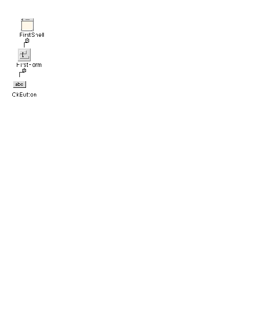
This example mentions only one widget explicitly, the leaf widget, whose widget name is "OkButton".
|
Note - The variable name for this widget has not been set. In resource files it is the widget name which is important. |
In an application you may find that you have more than one leaf widget with the same widget name. If, however, the widgets need different resources the default resource syntax described above would not be useful since it refers to all of them. Some resource settings would then be lost. The more widgets that are named in the resource binding, the less possibility of there being a conflict over widget names in the resource file.
Using the example above, the following shows how you can still have more than one leaf widget (in this case a PushButton) with the same name but with different labels.
1. Create the hierarchy shown in FIGURE 3-34, making sure that you have used the names shown for the widget names.
2. Select another Shell (of any type) from the palette and create a second hierarchy as shown in FIGURE 3-35. Give the button the widget name "OkButton", the same widget name as the button in the first hierarchy.
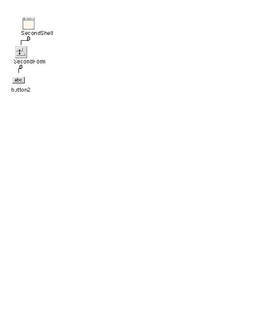
3. Specify the label: Ok for the button in the first hierarchy
4. Specify the label: Apply for the button in the second hierarchy
5. Select the widget FirstShell in the first hierarchy and bring up its core resource panel
6. Select the "Code Generation" page
7. Set the toggle labelled "Include in Resource Bindings"
This is the toggle which makes a widget's resource bindings "tight".
When the resource file is next generated, the widget with the tight resource binding will appear as follows:
XApplication*FirstShell*OkButton.labelString: Ok
9. Now do the same for the second hierarchy, including the widget SecondShell in the resource binding.
The binding for the second hierarchy looks like this:
XApplication*SecondShell*OkButton.labelString: Apply
Resources for the two buttons with the same widget name are now easily distinguished. You can add any number of widgets into the resource binding (in this example we could have added the Form as well). This would make the binding tighter and less open to ambiguity.
It is recommended that you set the "Include in Resource Bindings" toggle on all Shells in your design. This will not cause any unwanted effects and will prevent most ambiguities.
If you explicitly set the Label resource of the first button in the loose bindings example shown in FIGURE 3-30, but you do not set a loose binding, the following line is generated into the resource file:
XApplication*button1.labelString:Bound
If you have used tight bindings, which are described in Tight Bindings, to set a tight binding for the Shell, MyShell, without specifying any loose bindings, the following line is generated into the resource file:
XApplication*MyShell*button1.labelString:Bound
If you have set a loose binding to encompass all the buttons, as described in Example Loose Binding, the following line is generated into the resource file:
XApplication*MyShell*MyForm*XmPushButton.labelString:Bound
For more information on widget resources see Chapter 27. This chapter contains a summary of the most commonly used resources for each of the Motif widget classes. While this summary is necessarily brief, it will help you get started.
There are many books available that provide a more complete discussion of Motif widget resources. The Motif Programming Manual includes a summary which is both thorough and readable. Several other useful books are listed in Appendix F.
If you are using X-Designer with additional widgets, you should also consult the documentation provided by your widget developer.
Copyright © 2003, Sun Microsystems, Inc. All rights reserved.